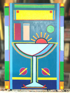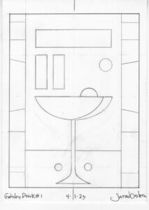
Vector Digital Version
Two years ago, in the summer of 2021 I painted six 24×36 inch acrylic on canvas paintings. It was the first time I had painted such paintings in a good few years. I enjoyed the painting them but I remember them taking me much longer than I expected them to. I think it took from May until October to get all six done.
In the summer of 2022 I didn’t get any such paintings done. At the beginning of 2022 I got it in my head to make my own illustrated version of “The Great Gatsby” and that’s what I worked on most of that summer. I’m still working on that project this year too and I ended up coming up with an idea to merger the two things this summer.
Almost all of the work that I do that I would classify as illustration I do on paper or digitally. All of my paintings on canvas I’d classify as fine art. There is naturally some overlap between the two but that is the basic breakdown.
Also along the lines of that breakdown is that if one of my pieces is meant to be seen in reproduction, either on screen or printed, then it might lean towards illustration. If it’s something that is best seen in person, such as one of my 24×36 inch acrylic paintings, then I see it more as fine art. But, of course, there is that overlap.
A couple of months ago I got a second wind with my Gatsby project. I had a lot of it done but I still want to work on some more ideas. The problem was that I didn’t have any ideas for what to do. But I didn’t give up. I kept at it until I worked out a few things I wanted to do.
One of those things was a bunch of drawings that were mostly of drinking glasses and design elements. I did a series of drawings of them, liked the way the elements came together, and decided to use Adobe Illustrator to make the finished versions of them. They were fairly quick to do and were coming out well. Except that I didn’t love them. I liked them but there was something missing. That’s when I had the idea to paint them.
I’ve always liked using geometric shapes in art. I like, rectangles, circles, and triangles. I’ve been using shapes of color in my art since back in my school days. In art school my senior project, back in 1988, was paintings with lots of blocks of color in them. I’ve been continuing to make such art since then. So it seemed that making a painting out of these Gatsby drawings was a natural. I was excited about it.
I dropped $120 on a box of six 24×26 in canvases (up from $90 for six canvases in 2021) and I was ready to go. Last year in anticipation of making some paintings I stocked up on some acrylic paint but then never made any paintings. But as a result of that I didn’t have to buy new paints this year before I started.
Here is the kicker to getting started with these paintings. I had somehow forgotten how much physical work painting was. My style looks kind of effortless. The drawing is simple and I lay down the paint in flat colors. It doesn’t look physically demanding. It turns out that it is.
Brush strokes are very important to me and my painting. When I lay down the paint, even though it might look smooth in a photo, it’s important to me to have the brushstrokes create a texture. Most of the time that means that I lay all the brushstrokes down in a single direction. They can be horizontal, vertical, or diagonal. That’s more physically taxing than I remembered.
Since each brush stroke has to be in the same direction I have to twist my arm and body around to reach that exact direction. Sometimes there is a lot of room to make the stroke and somethings there is not. It takes a lot of concentrations on exacting hand movements to get it right.
Sometimes if I want bigger texture I’ll go with a swirling brushstroke. You can see that in the yellow portions of “Gatsby Drink #1.” The swirling stroke makes the paint stand up and casts more shadows than my other brushstrokes. That really turns the paint into an object for me and gives it a physical presence that I like.
As I was being struck by the idea to make these drawings into paintings I somehow thought it would take me two or three days to get the painting done. After all it was just a little bit of line work and then some shapes of paint. It took me five days to get the whole thing done. Day one was just transferring the drawing to the canvas and the other four were painting. The transferring part didn’t take a long time but after I had finished doing that I knew I wanted to wait until the next day to start fresh with the painting.
The next day, within an hour of starting the painting, I realized that it was going to take me a few more days to get it done. Laying down the paint on the canvas was going slower and taking more energy than I recalled. It was then I remembered that I’d have to pace myself. In my younger days I could paint all day like this. I could paint for eight or ten hours. These days it’s more like six. So I got to work but didn’t push it.
Three days of painting like that and I was ready for the last day. The last day of painting is when I put on all of the finishing colored brush strokes. That’s a lot less physically taxing but takes a lot more thinking. I put down some lines of red and then contemplate what comes next. I do this all day.
Most of the day is spent in a chair sketching over an iPad photo of the painting or looking at the painting and then getting up to put on a few colored strokes. It’s pretty boring to watch as I’m not moving fast but it’s the most fun part to do.
I finished the painting on a Sunday and by the end of the day I was tired of looking at it. Sometimes I put a painting aside for a few days and then look at it again and make a couple of last brush strokes. I did that with this one but didn’t put anything new on it. It’s finished. Now I just have to figure out how I want it to appear in the book. I’ve got a few ideas but I’ll have to see how they work out. I’ll let you know.

