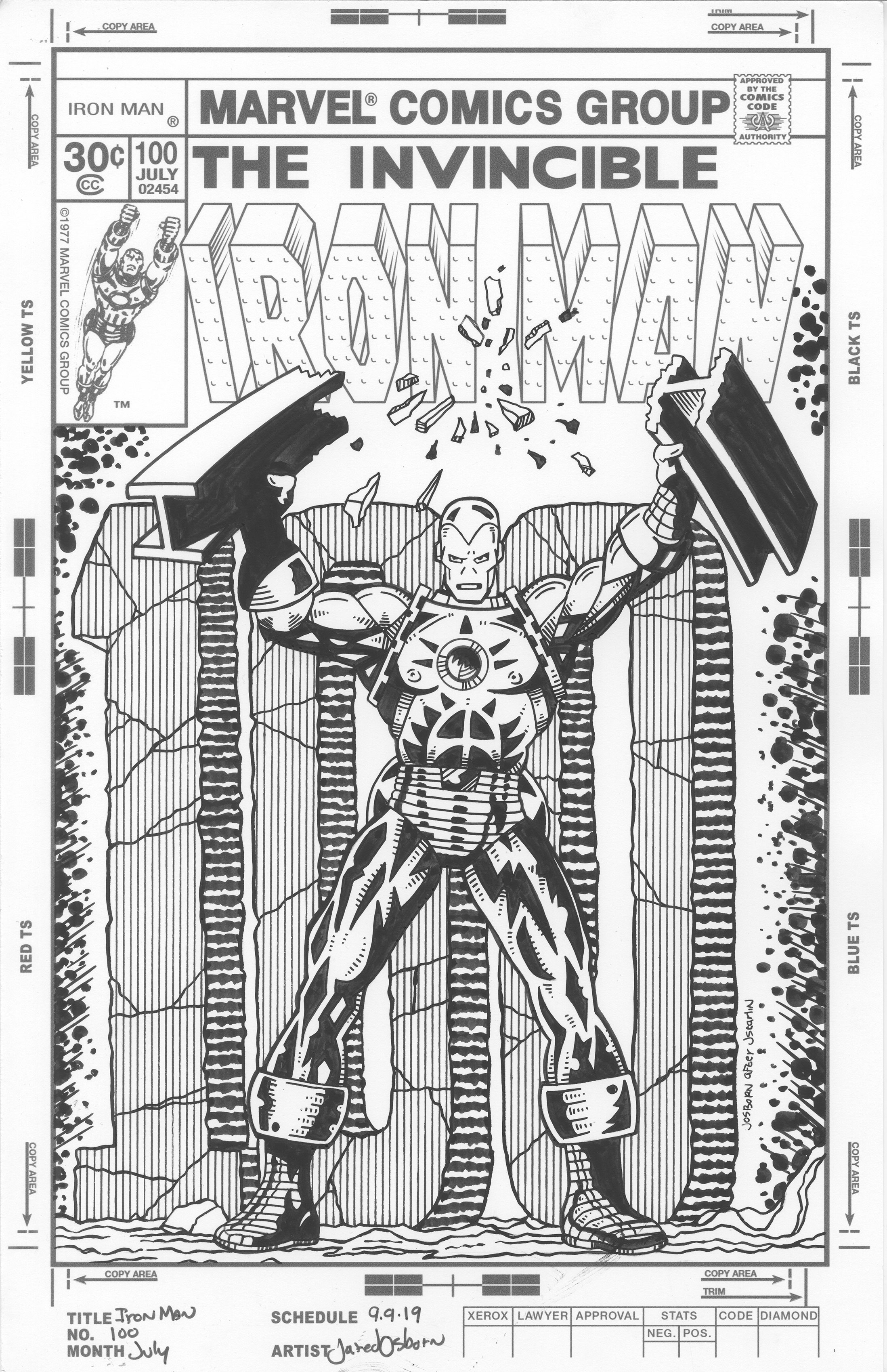
Failure and success go hand in hand. Maybe not in life but for sure in art. That’s my lesson for today. What brought me to that conclusion? Working on a drawing of course. Or an inking as the case may be. One of the things I occasionally like to do is cover recreations. That’s when I pick a comic book cover from sometime in the past an draw my own version of it. Sometimes I try to recreate the cover as exactly as I can and sometimes I do a interpretation of it. Both ways are fun so it all depends on what I feel like doing at the time.
The first step I take is to recreate a comic book cover’s logo and trade dress digitally. That way I can print those out on my drawing paper and have them look good and be ready to go. The logos on all the original covers were done as mechanical copies (photostats) like this and not hand drawn for each comic so it’s authentic. Except the original Iron Man comic had the logo pasted on rather than printed on the drawing paper.
The second step is to redraw the cover. This is the part I’ve never had down to a specific technique. I’ve used at least three different methods none of which I’m fond of. The first method is to draw over a scan of the cover on my computer. I’ve never taken to drawing on the computer so this is the method I like the least. Sometimes I can do it quickly so I stick with it but other times it’s too slow. The second method is to print out the cover in blue line, redraw it on a piece of paper, and then scan it in. I like this way but it takes a lot of work and concentration. I have to draw it in a fine dark line and that’s not my usual habit. The third method is a new one. I redraw the cover digitally but on my iPad. I still haven’t taken to digitally drawing 100% but I like this way better than on the computer. I have an Apple Pencil and that helps.
I can’t remember which way I redrew this cover but I think it was on paper. I was happy with it too. I think I got it right. That was until I got to the inks. I print out the pencils on a separate piece of paper to ink and that’s what I did here. I’m usually a brush person when it comes to inking but this time I chose a pen. I wanted the lines to look hard and mechanical. At least that was my plan. Nothing I did worked. It all looked confused and terrible. I picked away at that cover for a few hours and hated it. I’m not usually an insecure artist that hates his on work so when I do I know it’s justified. I couldn’t look at the piece any more so I put it away.
A few months later I pulled it out to see if I could salvage it. I worked at it for about an hour and it didn’t help. It was still a confused mess. I put it away again. Another couple of months passed and I once again pulled it out one more time. This time I decided to take a radical approach with it and try my busted brush technique on it. The sloppiness of this approach was the exact opposite of my hard line start to the piece. And it worked about as well. I messed it up even more and then put it away again.
The Iron Man #100 cover that I was working on was originally drawn by Jim Starlin. It’s one of the first Iron Man comics that I ever bought and it remains a favorite cover. It’s a simple design of Iron Man standing and snapping a steel I-beam while in front of the number 100 that is rendered in stone. Simple and easy to mess up as I had done before.
A recent Monday morning rolled around and I was looking for something creative to do. I had some energy in me but maybe not enough to really dig down deep and get things going. I decided I wanted to do some inking. Inking is creative but there is also a lot of craft to it. A lot of applying technique to make a drawing look good. It’s a different type of creativity than drawing with a pencil. There is a lot of acting when drawing with a pencil and a lot of reacting when drawing in ink over a pencil drawing. Reacting I could do that morning.
I decided to take the same hardline approach with this second attempt at the cover. I started it over on a new sheet of paper and inked with a Hunt 107 pen that has no line weight. But I wasn’t going to keep it that way. That was just my starting point. I was also mixing some brush work in with the pen work. This gave me thick lines when I needed them but the thin hard line as a default. For some reason it was easier to figure out what I was doing that way.
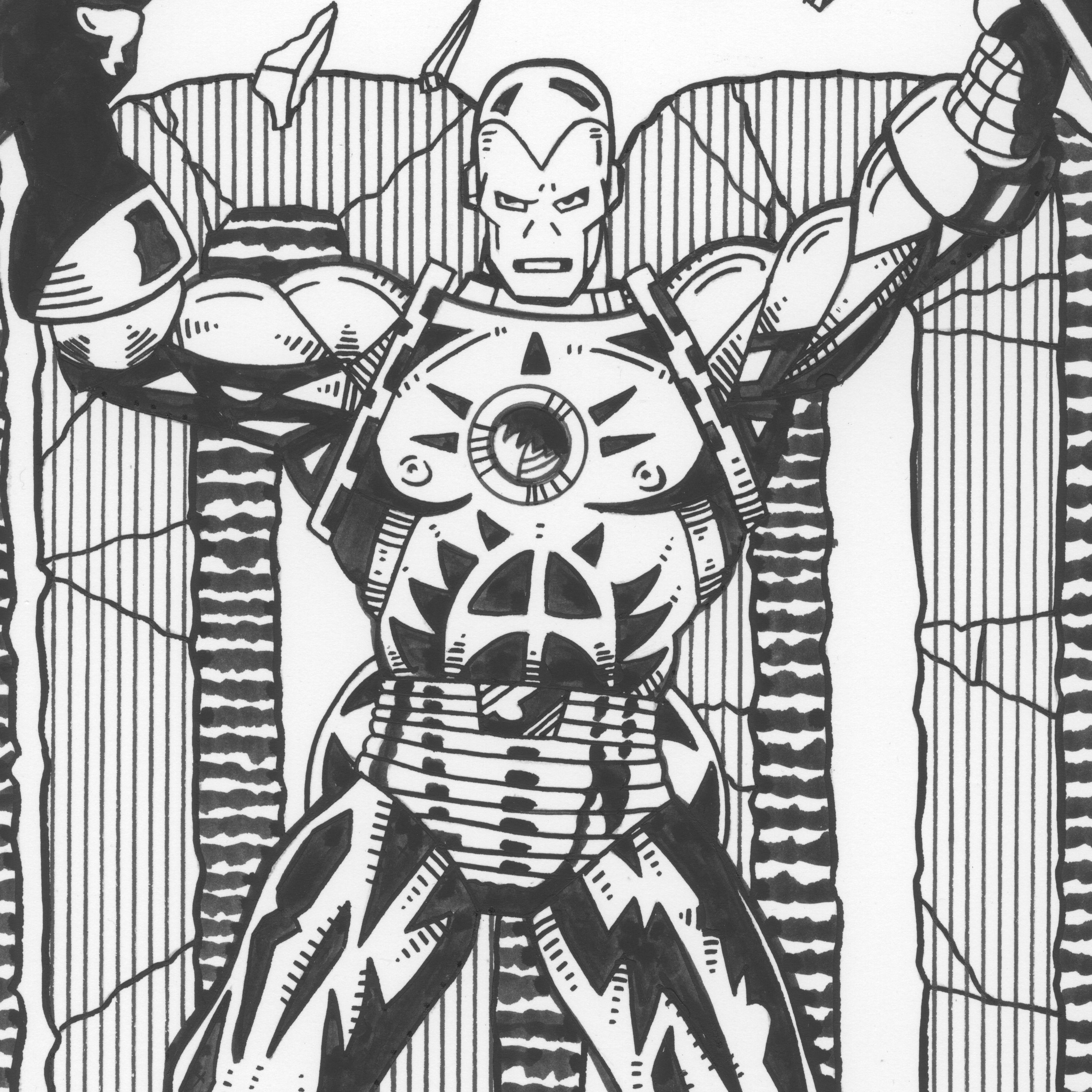
I didn’t mess it up this time. I went slowly and worked things out. Instead of Starlin’s finely rendered muscles I went with some of my “Painted Lady” body design tattoos. They weren’t easy to work out because a lot of them blended with shadows. This was the part I whiffed on earlier but this time I was in the zone. Some days are like that. I took the time to figure out what Starlin had meant by his shadows and incorporated my designs into them. Somehow I couldn’t do that the first time around.
It took me a good part of the day but I finished it. It kind of amazed me that I did. It also amazed me that I finished it by going back to my first approach. I really thought that I would need a radical new approach. That’s why I tried my busted brush technique and I thought I would go back to that or something like it. But in the end it was my original idea that worked. I just had to not fail at it.