Greetings Earthling
I’ve been writing about how tough it’s been for me to get things done in recent weeks but and that sometimes makes me forget that I have gotten things done. I got the first of my five 24×36 inch acrylic on canvas paintings done. It took nine days between June 21-29 to get I done. That’s a lot of time and one of the reasons I feel like I’m having a hard time getting things done. In that time I can get a dozen “One day or less” things done. Getting only one thing done seems like nothing. It’s weird.
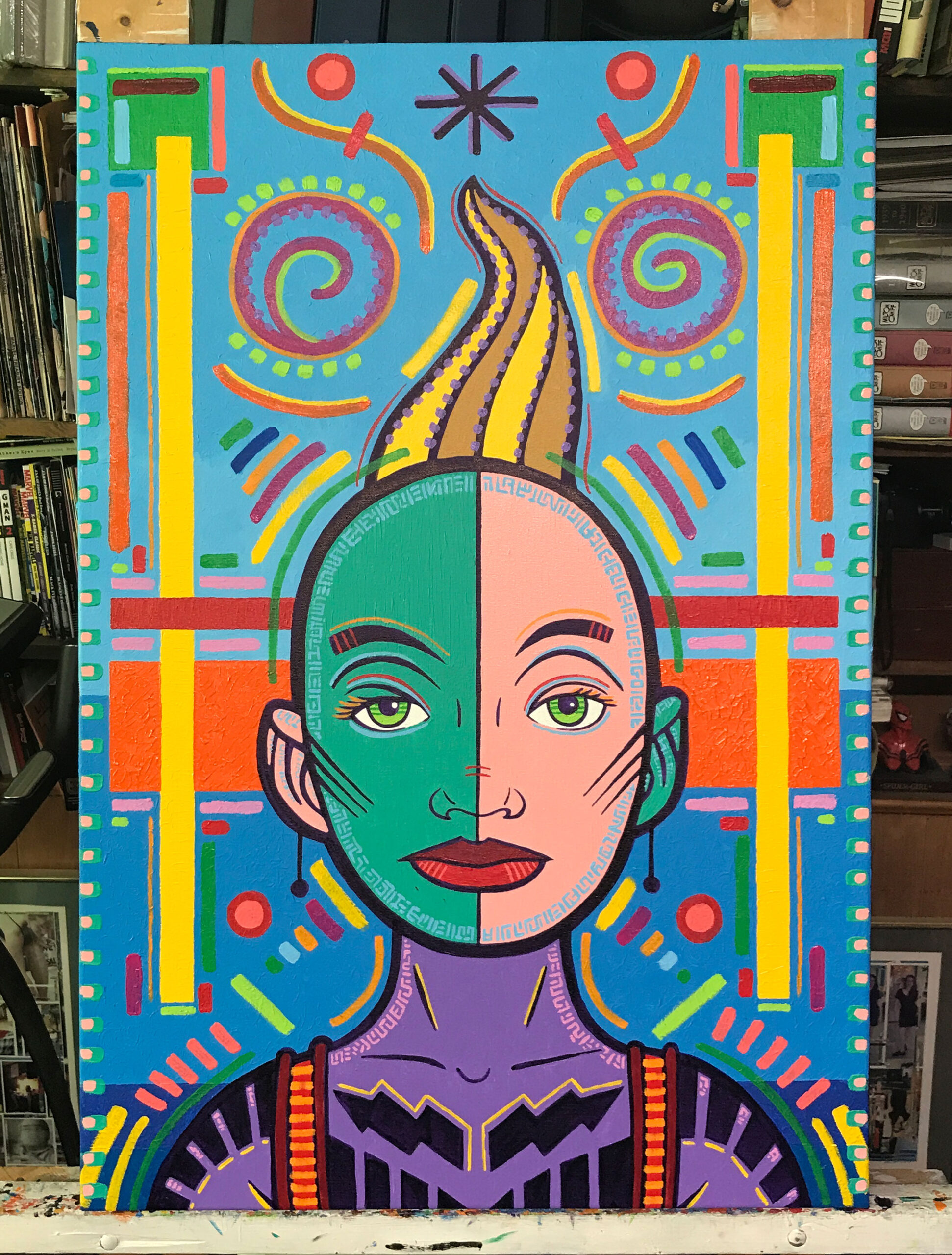
The title of the painting is “Greetings Earthling.” That’s what I imagine the woman in the painting is saying to us in her mind. It’s not that she’s an alien from space but she’s an outsider. She sometimes feels like an alien and sees herself as apart from the world at times. This is one of those times since we interrupted her thoughts.
I notice now that one of the original and obvious things about the drawing that the painting was made from is absurd now. There is an asterisk above her head that was the only thing there for most of the process as I didn’t add in all those colored brush strokes until the end. In comics an asterisk above someone’s head in a word balloon often means that their thoughts are being interrupted by something. In this case it means that we are interrupting her thoughts.
I remember using an asterisk in a painting only once before back in my student days. It was for a painting where I took a panel from one of my comic strips, blew it up, and painted it. The panel was one where a couple of cat and dog characters were being interrupted by the reader. They had turned to face out towards the reader and had an asterisk above their heads. I don’t know why I remember this since I made that painting back in 1987 and haven’t seen it since but that asterisk moment has stuck with me.
In making this painting I made the drawing first. Everything you see here painted with that dark purple line is in the original drawing. For many years I used black paint to make my line but sometime in the early 2000s when I switched from oil paint to acrylic paint I started using a purple line. Visually it still functions the same. The purple line is the darkest dark of the painting so it looks like a black line but it seems livelier to me. That’s why I go with it.
After the drawing is done I scan it in and make a digital color sketch of the basic colors. None of the little brush strokes or tick marks of color are figured out at this stage. I do figure out the large blocks of color though. The orange behind her eyes, the two thin vertical boxes of yellow, the red horizontal box, the two green squares up top, and the blue boxes in the background are all figured out at this stage. The color boxes are as much part of the composition of the drawing as they are part of the color.
I think the two colors that I find most pleasing are the purple of her body and the orange behind her head. The orange has a lot of texture to it and catches the light in a way that’s hard to see in a photo or reproduction. The purple is just a rally nice color. It’s a straight out of the tube purple and it anchors the reality of the painting for me.
After I painted the purple lines in I put in the color. That usually means brushing the paint into the area between the lines that it’s supposed to go in and then pushing the paint towards the line. I then pull the brush back in the direction I want the brush stroke to go. The direction of the brush stroke affects how the light hits the paint. It’s a very particular way to paint that I’ve been doing for a long time.
It take a long time to put paint down that way and it takes a bit of discipline. I’m not done with the purple line though because painting in this fashion, pushing the paint up against the line, often ruins the quality of the line. The line becomes a negative brush stroke rather than a positive one. It loses the power of being seen as a single brush stroke. To counteract this I get my brush, fill it with purple paint, and repaint the purple line. It usually doesn’t take as long as the first pass but it takes a while. It’s especially important in places like the eyes that get obscured when the color paint is pushed up against them.
So it goes purple line, solid color, purple line. That’s the tough part of the painting. It takes focus, concentration, physical stamina, and can be meditative at times and tedious at other times. It’s all about following a plan. Next comes the unplanned part. All those brush strokes of color the finish off and pull the painting together.
As I’m working on the painting I often have some idea of where the first brush stokes of color are going to go. With this one it was the marks around the shoulders and the paint strokes along the color blocks. But after that there is a lot of looking, contemplating, and distracting myself for a moment so I can look again with fresh eyes. Often one mark suggest the next one. Such as the lines that radiate like horns off the top sides of her head. First I made a yellow one, then magenta, and then the rest followed. Not right away but after I made one stroke I looked at the painting to figure out if it needed another.
The part that took the most thought were the two spirals above her head. I looked at that area for a long time and knew something was needed there. I didn’t want it to be too dense and fight with the drawing. I thought about it a long time and even drew some things in with chalk (first time I ever thought to do that) before I settled on those spirals. They’re almost like another set of eyes up there.
The last thing that I painted and what pulled the whole thing together for me are the yellow stripes on her suspenders. Those catch me eye. As I said before one brush stroke often suggests the next but when I can see no more suggestions then the painting is finished. After I put those yellow strokes in I knew I was finished. Look at that. I got something done.