Texture 06
Last week after I finally printed out a second proof of my illustrated version of “The Great Gatsby” things ground to a halt. I didn’t know what to do with it and had no idea what to do next. I had a half baked idea that it needed more double page illustrations but I had no idea of what they should be. I tried working up sketches for a couple of them but got nowhere. So I put it aside and worked on other things.
Then, as I was thinking about it this week, the problem I was having with it hit me. I didn’t like the design of the book very much. The illustrations for the book took so much work that when I finally did some design work on it (last year) it was really only very basic design. I left most of the page open with the type filling only about 60% of a single 9×12 inch page. It was, sort of, modeled off another book I saw and that one had very minimalist design. So did mine but mine was boring.
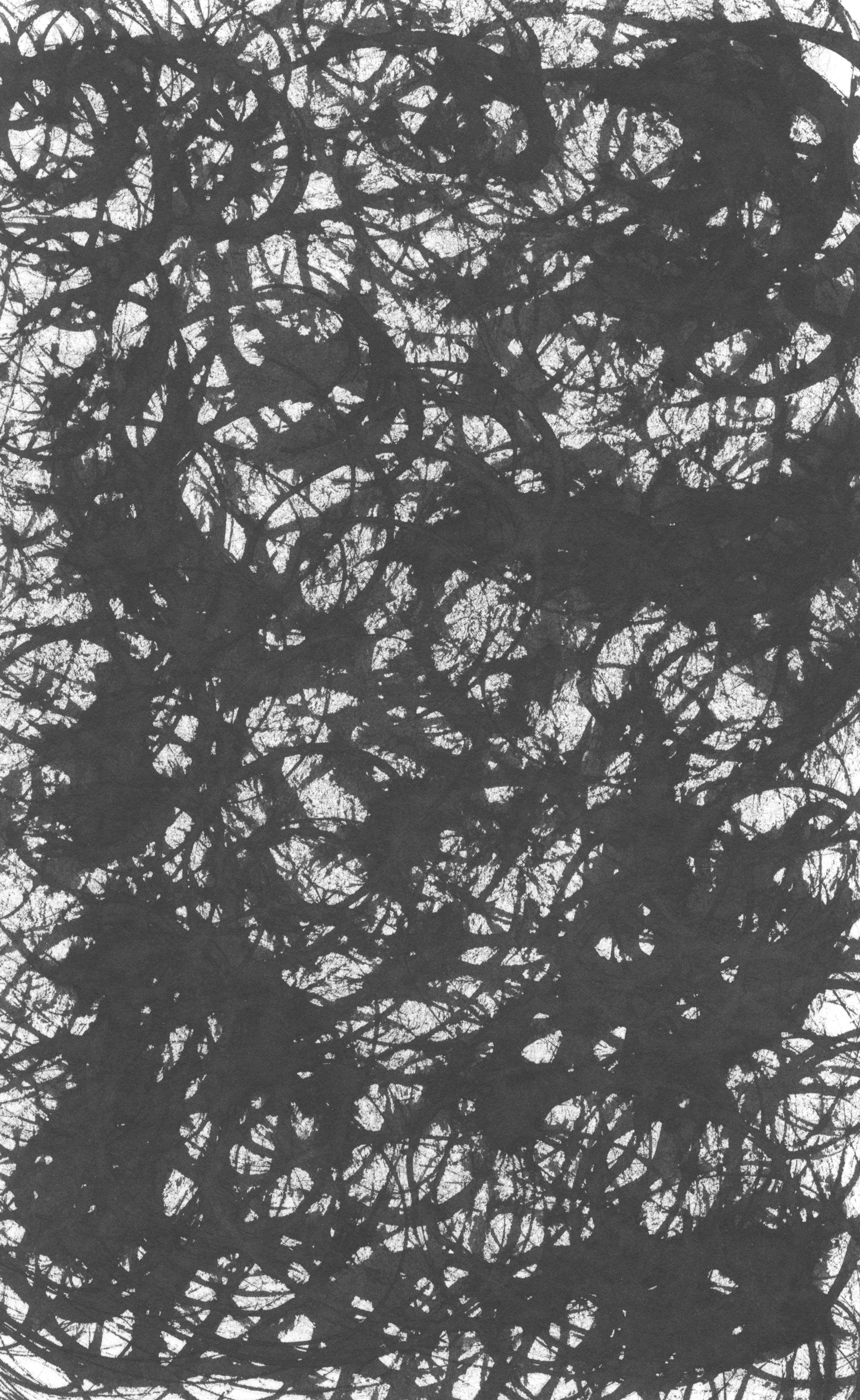
I think it was last summer (August 2023) that I was working on a print and needed a digital texture in it. That’s the sort of thing that I like to do with ink and then scan it in (Making Textures Blog). So instead of making one texture I filled a 68 page sketchbook with them. Then, in April (2024), I filled a 84 page sketchbook with more textures. So I had 152 textures all scanned in and ready to use for whatever I needed them for.
I enjoyed making the textures but laughed a little bit at myself. I needed one or two textures for the original print but I filled the whole 68 page book with them instead. I overdo things like that at times because I know that it’s good to have a library of textures to choose from. It’s easier for me to make a whole bunch of them at once than to make them one at a time as I need them. And it paid off that I had them all ready to go.
I decided that what the design for the Gatsby book needed was some texture and color for visual interest. I had about two inches of white space on the outside edge of the pages and an inch and a half on the bottom of the pages to play with. I decided to put an “L” of texture on the left hand page and then mirror that as a reverse “L” on the right hand page. It is still a fairly simple design but I think it works well. Especially with each double page spread having its own texture.
Texture 15
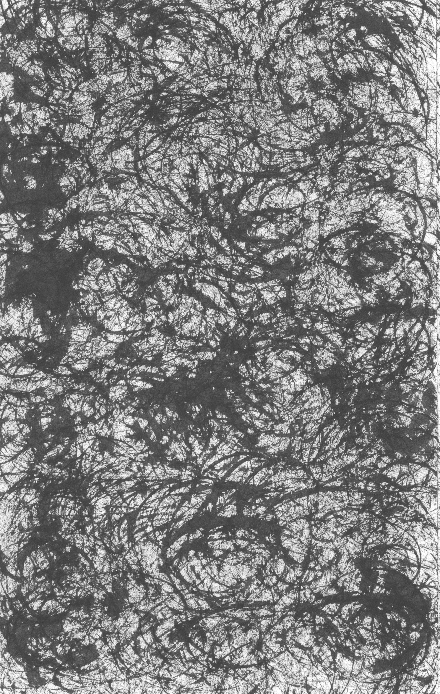
The next thing to do was to figure how to actually execute the design. It’s around a 200 page book and every page (minus the illustrated pages) had to have this design put on it. The first thing I did was to figure out the Photoshop work. I made a CMYK 9×12 inch 450dpi template and then opened a texture. Each texture was made with black ink but I decided I wanted them to be in color. So I turned the original greyscale file into a DuoTone document. This meant that I could pick a color and the black and grey would be turned into that color.
After turning the grey texture into a color I pasted it into the CMYK 9×12 inch 450dpi template. I sized it properly and moved it in place. The next step was to mask out where the text would be. I wanted the texture on the edges and not behind the type. So I figured out the proper place for the texture and then used a layer mask to hide the texture where the type would be. I also made the edge of the mask fuzzy so there wouldn’t be a sharp line where the texture ended.
The next step was to bring the Photoshop texture into the inDesign design file. That just meant making new layer named “Background” and placing the texture in a box on that layer. Simple stuff.
I also leveraged the template to make each texture a little easier to place. When I finished texture 15 I would “Save As” and name the document texture 16. Then I would open texture sixteen, turn it into a DuoTone color document, and then paste it into the texture 16 document. After adjusting it I could copy the layer mask from the old one and give it all a save.
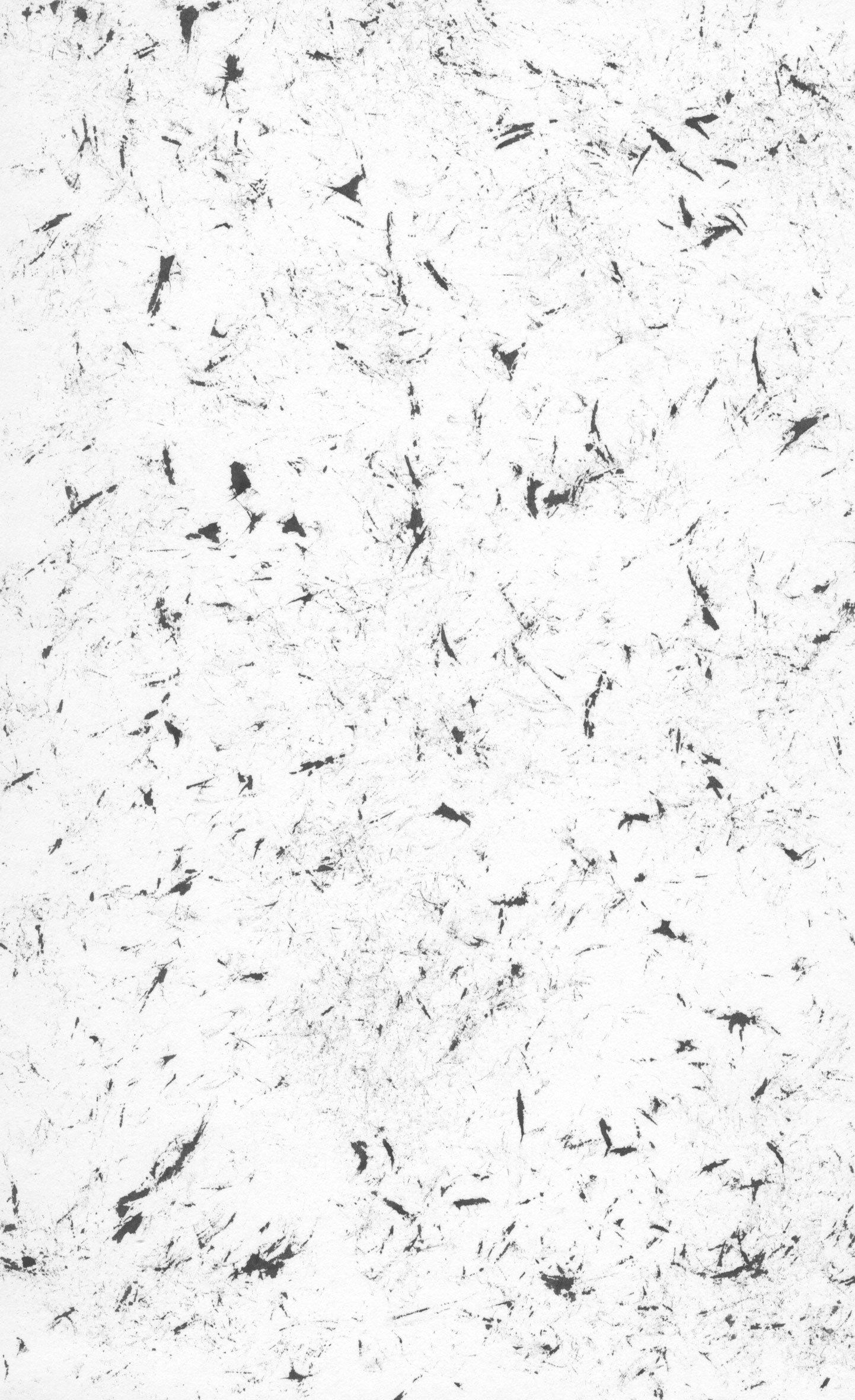
Texture 29
None of that was hard but I had to do it all about eighty times. I worked on it for about three hours on Friday and then another five hours on Saturday before it was done. It was boring and repetitive to do but I like the way it looks now. I still don’t think I’m done with it yet But it looks better than it did.
One more things that I have to do before I print another proof is to proofread the whole thing. “The Great Gatsby” has been in the public domain for a couple of years now and I got a copy of the text off the internet when I started this project. The first thing that I did was to typeset the whole thing but there were a lot of formatting problems with it. That often happens with large blocks of text that you’ll find on the internet. Formats aren’t compatible and things get scrambled. That and typesetting for a book is it’s own specific thing compared to type that was prepared for the internet. It took a while to typeset the whole thing but I still found mistakes I had to fix as I went. It really does need a good proofread.
I had been treading water with this project for a few months now. That’s okay because there is no deadline on it and I have other things to do but it does feel good to get going on it and get a design that I like better. We’ll see where it goes from here.