I put four different types of drawings onto my easel the other day. To look at them. I do that all the time with my drawings and paintings but I usually put drawings of a single type or from a single series up to look at. That gives me an idea of what I’ve done and where I’m going. Putting the four different types of drawings up was different. It ended up making me compare and contrast them. Especially since all four are the same size but made with four different techniques. That’s worth contemplating.

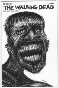
The Walking Dead “Monster Nine” – This is one of my hand bound sketch covers. Like the World’s Finest 290 sketch cover it looks like it’s the same size as the other two but the drawing actually continues on the back cover. On both of them there really isn’t much to the back cover so it’s easy to count just the front. It’s only a piece of shoulder on the back.
“Monster Nine” is the only one that’s in black and white. It’s actually only in black because it’s made with black ink and no white paint. The only white on the cover is the white of the page. “Snow Creep” is also in black and white (with the paper having color on it) but it’s made with black ink and white pastel. That’s a different type of black and white.
As the title implies I’ve done eight monsters on Walking Dead covers before this one. Some patterns have emerged. This monster is of the skinny-necked variety. I seem to got thick or skinny with the necks. Plus he has more normal teeth. The other teeth I do are all giants fangs. There are only four or five fangs across and they are big sharp triangles. This guy could have any number of teeth.

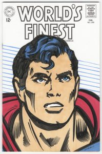
World’s Finest 290 – This is the second Superman I’ve done for one of these sketch covers. With these I’ve been taking a headshot from a panel on the inside and blowing it up to fill the cover. I’ve found that it isn’t always easy to find a good head shot inside. Each comic only has a couple of choices that are suitable for my purpose. Since I’m going in tight for a close up I often have to add a little art to the shoulders. Often word balloons cover parts of the shoulders.
Since I’m taking a headshot that could only be an inch tall and blowing it up to six inches tall the lines get bigger too. And I keep them that way. I like the big chunky forms that made up the eyes and rest of the face when they’re blown up. I have no interest in redrawing them with smaller and more detailed lines. I found them less striking when I tried to do that. Plus it a challenge to make the shapes work at a larger size. I find that fun.

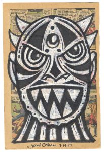
Monsters On Comics “Snow Creep” – This is the first one of this type that I’ve done in a while. I first started drawing on pages torn from a comic because my local comic shop was throwing out some destroyed old comics but some of the pages were still good. I brought them home and used marker and white conté crayon to draw on them. But soon I was out of conté crayon and bought some new ones to replace the old ones. Turns out the new ones were crap and didn’t get the job done. So I stopped making these.
Of course you noticed up above that I wrote this drawing was made with pastel and not conté. When I ordered some art supplies I added in a Rembrandt super-soft white pastel. When it arrived I decided to give it a try with a new monster drawing. It worked like gangbusters. The pastel was even softer than the good conté crayon and it was like working with a stick of butter. The white come off the pastel stick so smoothly. Though I was so busy learning the new tool that I didn’t concentrate on the drawing as much as I should have. I don’t think this is one of my stronger monsters. I didn’t get the eyes anywhere near even on the face as one floats higher than the other but since it’s a weird monster it’s not that big a deal.

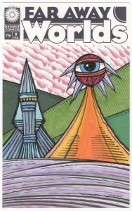
Far Away Worlds 9 – I consider the final one of the four to be the most fanciful. I don’t do a lot of landscapes so I started doing this series so I could let loose a little. I could throw off my shackles of figurative drawing and make something out of whatever crazy lines came out of my brush. I’d work with horizontals, diagonals, and verticals to create and alien space rather than my normal shapes and forms.
Of course I had to throw some eyeballs in because I didn’t seem to like the drawings as totally non-figurative. I also think a giant eyeball staring out at us makes the drawing a little more creepy. And oddly a little more relatable too. The landscape seems a little more impenetrable without the eye there. I can relate to the eye and it lets me into the weird landscape space.
Despite the ground being a purplish color this one seems more like home than some of the others in this series. The mountains are green and it looks like normal daylight. There are no strange moons or planets in the background. This one is almost comforting.
So there you go. Four different approaches and four different styles. All lined up in a row they look pretty cool. They hang together yet are distinct from one and another. They are familiar yet odd. Superman sure has a normal face but that Walking Dead monster isn’t as human as he could be. But he’s still more human than “Snow Creep.” Are they less monstrous than that giant eye looking at us from the Far Away World? A solid question. Back to contemplating.
Discussion ¬