As I continue my quest to make my own illustrated version to “The Great Gatsby” I come to a point where I’ve made a couple of dozen finished illustrations so what I should do next isn’t and easy question to answer. One of the things I’ve wanted to do since the beginning but have avoided is dealing with the main character’s, Nick Caraway, description of a painting from his dream.
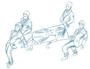
Here is the quote right from the book, “I see it as a night scene by El Greco: a hundred houses, at once conventional and grotesque, crouching under a sullen, overhanging sky and a lustreless moon. In the foreground four solemn men in dress suits are walking along the sidewalk with a stretcher on which lies a drunken woman in a white evening dress. Her hand, which dangles over the side, sparkles cold with jewels.”
Despite all the illustrated versions of “The Great Gatsby” that I’ve seen in the last year I haven’t seen anyone try to tackle that vision of a painting. The reason why is easy to see. It’s a complex vision done in the style of a famous and idiosyncratic painter. El Greco has a unique style that is hard to get across in an illustration. It’s also not one of the grand images of the Jazz Age that the book is otherwise filled with.
Though I wished I could do an illustration of the scene I didn’t think I could do it justice so I ignored it and worked on other illustrations for the book that I could pull off. Or at least ones that I thought I could pull off. It’s taken a while to get things done and I didn’t succeed at everything. But since I did get a lot of illustrations done I thought now was the time to put some effort into the El Greco scene.
I started with the five figures. Four men carrying a woman on a stretcher. I started drawing the two men in the front. El Greco draws a lot of his figures tall and a little distorted so that was what I went for. I didn’t reference these figures and made them up out of my imagination. Long legs and arms dangled from the sides of these two men. They worked out pretty well for me.
When I went to draw the two men in the back I had much more of a problem. I couldn’t get them right. I wanted them distorted like the two in front but I could not get them in the correct perspective. Or at least a perspective that looked correct. Cheating at perspective to make something look right is common artistic practice. Sometimes something that is technically correct doesn’t look right.

After struggling with the two back figures I decided to reference them. I used an artists 3D modeling tool on my iPad. It’s real easy to use. They give you a 3D model of a person and you move it around and pose it until its in the position you want. So that’s what I did. I posed two 3D models, took screen shots of them, and then drew over top of the model in Procreate on my iPad.
With the basic drawing of the two back figure done I arranged all four figures in a composition in Photoshop and printed them out (with a stretcher between them) on a new piece of paper in blue line. I drew over that blue line drawing to make my finished pencil drawing. I had to adjust the legs and perspective on the two front figure but in the end it came out fine.
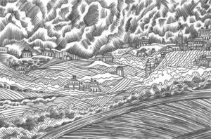
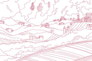
I still had no idea what I wanted to do with the background though. It was supposed to be an El Greco night time landscape so I looked some of those up on the internet. I found one I liked and decided to draw right over it. Using the painting as a guide I drew my own landscape basic composition. I drew some houses, hills, the sky, a road down in front, and some bushes here and there. Except it was very basic. There wasn’t any technique to it and I had no idea what technique would make it look good. I was stuck.

For a few days I thought I bit off more than I could chew. I had no ideas in what direction to take this El Greco dream painting. Then I remembered a technique that I tried out briefly about five years ago. It involves using a dark pencil, shading a drawing with the pencil, scanning in the pencil drawing, and then digitally coloring over the pencils drawing with flat color thus using the pencil shading for roundness. I never managed to pull off anything good with the technique but I thought it might work for this landscape.
I did the figure drawings on a separate piece of paper from the landscape so that I could concentrate on each. I got out my Wolff’s carbon pencil and drew the whole landscape, over half a day, with dark directional strokes. I was using the pencil strokes to imitate brush strokes. I think the landscape and houses came out well.
Next I worked on the figures. I printed out my finished figure drawings on an 11×14 inch piece of Bristol. For these I used my .7mm pencil with dark 2B graphite. I used the pencil line to imitate brush strokes and drew all five figure in this style. The problem is that’s not really how El Greco painted his figures but they still look interesting. I’m happy with them but I’m happier with the landscape.
Now I’m stuck at the digital coloring stage. As I wrote earlier I never pulled anything big off with this style so I’m not sure how to finish the coloring. I’ve been laying flat color over the figures so far and it doesn’t look anything like El Greco or how I want it to. I think my next step is to leave the figures alone and color the landscape. It came out better than the figures so I think that’s my way in. I’ll have to see. I’ll let you know how it turns out.
