Sometimes it takes me a while to get around to things. Case in point is that I finally finished some EC Comics sketch covers this week. I got the idea to do them months ago and they’ve been sitting around since then. One day when I was at my local comic shop I was looking around their dollar bins for anything interesting. I ran across these 1970’s reprints of old 1950’s comics. EC Comics is famous for their horror, crime, and mystery comics. The HBO show “Tales From the Crypt” is based on them. I bought three of them for three dollars and decided to make my own sketch covers for them.
The first part of making a hand bound sketch cover out of a random comic is to make the logos. Though it can be time consuming this is the easy part for me. I remake the logos as vector drawings in Adobe Illustrator with the original logo as my guide. I find this to be a fairly mindless endeavor sort of like putting a puzzle together or putting a piece of furniture together from a kit. I got this part done right away. I think I rebuilt all three logos within a week after I got the there comics. Then they sat there.
The problem was that I had no idea what to do. First of all “Sketch Covers” is a bit of a misnomer for me. I don’t really sketch on them. I make finished drawings out of them. That takes more time so I need a good idea of what I’m going to do. I had none. Second of all EC Comics had excellent artists and those artists did excellent covers. It would be hard to come up with something that was anywhere near as interesting. I had nothing so the comics just sat there as time passed.
I hadn’t made many sketch covers in a while so I was thinking up any ideas I could. One idea was to mix them with my Super Hero Cartoon Art Cards. Those are the drawings I do at art card size of a super hero saying something. It’s a head and shoulders shot with a word balloon above it. I enjoy those little faces and pithy sayings. I wanted to make them bigger and put them on a sketch cover. I looked around for a sketch cover to draw on and there were the EC ones.
The EC Comics line didn’t have stories with continuing
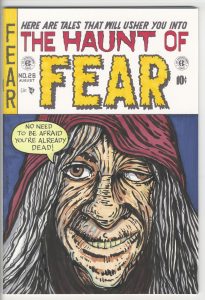
 characters in them. They didn’t have a Spider-Man or a Superman. The comics were all anthologies of short stories that shared a horror or crime theme. But what EC Comics did have was horror hosts for their tales. A host would introduce the story and then wrap it up at the end. The most famous one is the Crypt Keeper but there were others too. The comic I had feature the host “The Old Witch” so that’s who I went with for my sketch cover.
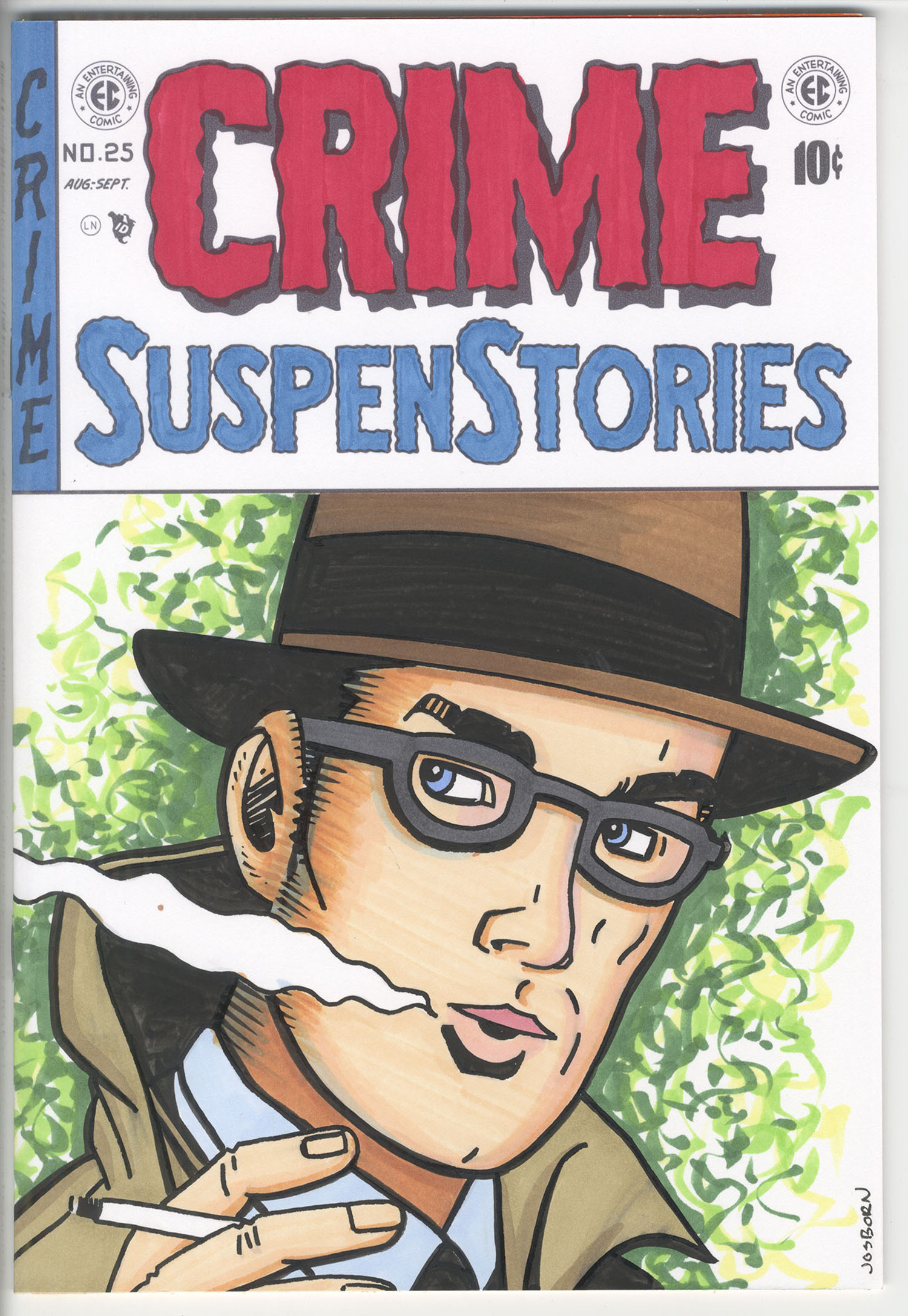
My Old Witch cover is pretty straight forward. I drew her ugly old face and gave her a world balloon. It came out okay but in the end it was just a B rather than an A. As I was contemplating how to improve with the next one I thumbed through the crime one I had. The EC Crime comics had no hosts so I was wondering what to do with it when a panel caught my eye. It was a drawing by Bernie Krigstein and it was beautiful. It was a panel of a guy smoking a cigarette and looking over his shoulder.
A few years ago I did a series of sketch covers where I took a 1980s comic, picked a panel with a head in it, and redrew that panel for the sketch cover. The problem I had was that the art inside wasn’t always that good and I often had trouble picking a panel to work from. As a result only one in three of them was really any good. But this Krigstein panel in the EC comic was beautiful. So I decided to use that for the sketch cover.
I’ve written before about my digital drawing process with my iPad and iPencil and that’s what I used here. I didn’t even scan the panel in as I normally would do. Instead I took a photo of the panel with the iPad, opened it up in Procreate, created a new layer, and drew on the new layer right over the panel. Then I took that digital drawing put it into my Photoshop sketch cover template and printed it out to be inked. After I inked inked the drawing I colored it with markers. With all the creative work done all that was left was to pull the staples out of the comic and put the new cover on. It all went smoothly for this issue.
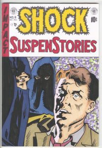
For the third cover I did I picked a panel drawn by Wallace Wood (I’m going with Wallace rather than Wally, as he was often credited, because I’m told by people who knew him that he never went by Wally. He went by Woody to his friends). I found it a bit tougher going that the Krigstein one. Or at least it was more time consuming. The Krigstein one was more up my alley. His type of simplicity is my type of simplicity so I understood it well. Woody’s drawing looked simple at first glance but as I was redrawing it I realized how complex his simplicity was. Or maybe it was just that is was such a different simplicity from mine that I had to pay attention a lot.
Woody put a harsh lighting effect on the face that was masterful. He broke the shadows down into black shapes that reflected the forms of the face. All of his simplicity was based upon observed light where my and Krigstein’s simplicity was based more on the shapes of objects. It was interesting to me as I worked on the Woody one how much more attention I had to pay it since it wasn’t my usual way of thinking. It took me about twice as long to make as the Krigstein one. I didn’t think that would be the case when I started it.
One last thing of note was that the Woody one was easier to color than the Krigstein one. Since it had a lot of lighting effects in the drawing there was no need for me to put any into the color. It was a simple matter of putting in flat color and letting the ink drawing do the rest.