I haven’t done this in a while so this week I’m going to take a look at a single piece of art that I’ve done recently. I’m going to go with one that’s on my easel at this moment so it’s a bit of a random pick. As a matter of fact I just cleaned off my easel of a bunch of things. I don’t always use my easel for painting so when I’m not in the middle of a painting I stack up the art on paper that I’ve made. That way I can get a look at my current stuff.
My easel was getting full of pieces on paper and some were begging to fall of it so just this week I grabbed a bunch of older pieces from the stack and put them away into portfolio books for storage. That way I can still easily get to them if I want to. I moved a lot of my paper work from boxes in a cabinet to portfolio books on a shelf just last year. But on to the piece that’s in the front.
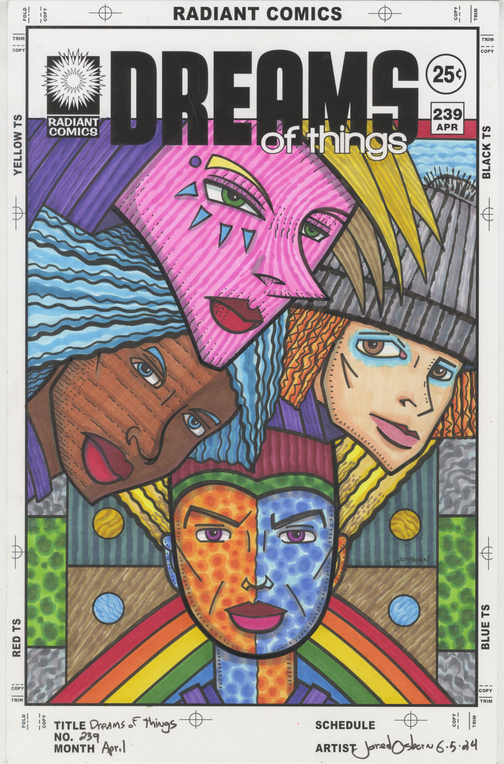
“Dreams of Things” #239 is another in my “Covers to Comic Book That Don’t Exist” series. It’s hard to believe that I’m closing in on having made 250 of these covers. When I look back at them (such as when I put them all in portfolio books) I can see patterns in them. Themes that I had, mostly in my subconscious mind, that would come and go in them. That makes sense since I come up with these images using a Surrealist Automatic Drawing method that mines the subconscious for ideas.
Recently I noticed myself doing a lot of “Dreams of Things” with two faces on the page. Often one was above the other in a two headed monster look. I don’t know why I was on that two headed kick but this one ups the ante with four heads in one piece.
The bottom head is the foundation on which the other three heads sit. There are even a couple of inverted triangles that support the composition. The first is that wide rainbow triangle behind the bottom head. It supports everything on top of it. Then there is the yellow triangle of hair that the bottom face has. That hair anchors the two faces above it to the bottom face. These triangles of support are important to the piece because they ground everything. Without them the heads would look like they’re floating and I don’t want that.
The background of the piece is all shapes and textures. There is very little deep space back there. It’s more of a modernist flat art space. I kept the space in back easy to understand because the space around the heads isn’t easy to understand. The scene makes no three dimensional sense but it makes compositional sense. At least that was what I was going for.
One of the first things I notice about this piece is the eyes. All four characters are looking at us a little bit differently. Often I have my characters staring directly out at the viewer. But in this case only the bottom one is doing that. The one on the left is almost but not quite looking at us. The one on the right is looking at us but softly and nearly out of the corner of his eyes. The one on top is squinting off into the distance. Four characters and four looks. I don’t often do that.
I just referred to one of the characters as “He” but as often happens in my drawings the faces are androgynous. In my head they are male or female but then they can switch on me. You can see them as whatever gender you like. It’s okay to call them he, she, or they. I do all the time.
I also like to vary the skin color of my characters a lot. If I don’t pay attention to that I’ll make everybody a similar skin color to my own. That’s just how the human unconscious mind works so I try to make conscious choices to keep things varied.
In a fantastical drawing like this one it’s easy to vary the colors of the faces since I’m not tethering it to reality. The brown and peach color faces are close to reality but the hot pink and blue/orange faces are from a dreamworld.
I think the first face color I put down was the blue/orange one. I started far out there. Sometimes when I have a face that’s facing forward I like to split it in half with color. I’m not 100% sure why but I think it’s because a face like that can be a wide expanse of the same color and that can get boring. If I split it up with wild colors it’s more interesting. I went for some monochrome two tone speckles on the face too.
The next two faces are the more realistic ones. They bring some regularness to the craziness of the rest of the piece. The brown face has stripes on one side and blue hair so it’s not too grounded in reality. The peach face also has a grey hat over its orange hair so the grey sits back in a neutral space and lets the colors pop out in front of it. Otherwise all that orange would be fighting for attention with the hot pink face.
The top face is the most colorful one in the piece. Hot pink with darker pink rugged stripes, a purple shirt, and yellow hair with its own stripes running opposite of the face stripes. I think it makes a nice cake topper.
Overall I like the way this one came out. Part of that is that I broke my own two face mold that I had been doing lately and made something similar but also wildly different. I wasn’t sure if I could even pull off four faces piled onto a cover like that but I think I did. It may not be my favorite piece ever but I like it.