As far as I can tell the last time I wrote about an individual “Dreams of Things” cover was back at cover number 170. Being that I just finished number 224 that means that it has been a while. Time relentlessly moves forward.
Just after I finished marker coloring this cover I prepped a bunch of others so that I could draw them. I picked out eight thumbnail drawings from my 2022 Inkbook and digitally printed them out, in blue line, onto 6×9 inch Bristol paper. Now I will draw them over time.
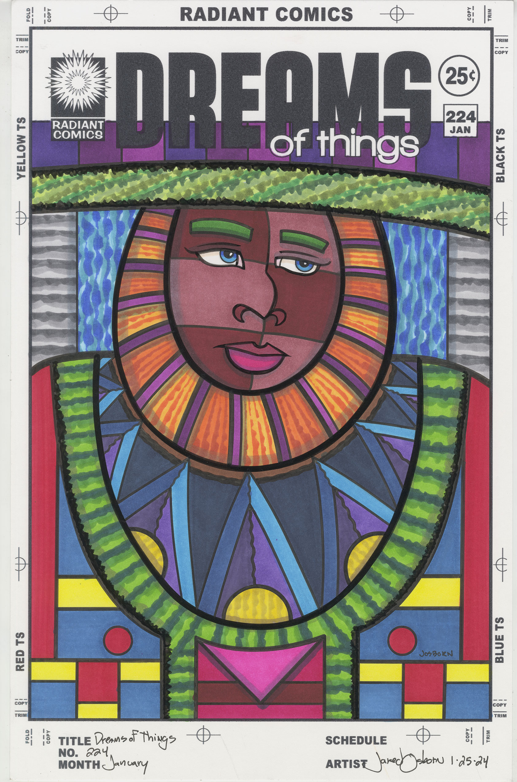
But back to the cover that is in front of me. Number 224. The first color that jumps out at me when I look at this is the purple. Or rather the purples. There isn’t a ton of purple in this piece, it’s not a theme, but they seem to jump forward at me. There are three purples up top that are underneath the logo, two purples that stand out against the orange of the collar, and two more purples in the shirt.
The contrast between the orange and the purple in the collar might be my favorite part of this piece. I like the way they bounce off each other. Though the purple catches my eye first it’s the orange that really stands out in this piece. It’s bright and almost makes a bullseye of the brown face. It’s the only place orange is found.
I bought some new Artfinity markers since I last wrote about one of these covers and those purples are some of those new markers. It was nice to add some new colors to my marker palette.
As a side note I also bought some Blick markers last year and there was one, 010 Purple, that was my favorite new color in the group. Unfortunately the color proved to be fugitive. When I get new markers I swatch them out. I have a piece of paper with boxes on it and I sample the color by filling one of the boxes with it. I keep those swatches on my drawing table as I work to help me pick colors.
Over a few months time I noticed that the 010 Purple looked like it was changing color. It was getting less purple and more magenta. I drew a mark with the marker next to the old one and sure enough the old swatch had changed. In only a matter of three or four months. I’ve run into some markers that are fugitive, they lose their color over time, but it usually takes years for the color to fade. I’ve never seen anything like one that changes in mere months. I stay away from that marker now. I even went to the Dick Blick website and left a review to note that was happening.
Blue might be the dominant color in this piece. There is a lot of it. Blue is behind the person’s head, blue is in his shirt (I think of the person as a “He” but his gender is really unclear), and there is plenty of blue in the Mondrian-ish design down the bottom. There is a lot of variety that keeps the color from being overwhelming. The contrast between the dark blue and bright blue in the shirt makes for a nice look.
Green might be the number two color by volume. There is a green stripe across the top and a big green “U” shape in his shirt. I made them both with the side of the brush marker with a shakiness to the stoke so the greens look a bit like grass. Especially the top stripe. I like to put marker color down in textured patterns to mix up the look of things. Solid color needs something to contrast against.
On either side of the blue background are stripes of gray. I used these neutral grays to help the background stay in the background and not creep forward visually. The blue is bright and strong so the grays’ halo tame it. The horizontal texture also helps.
I actually colored this one from top to bottom. That’s not always how I work but this one ended up being done that way. As a consequence I had plenty of time to think about what I wanted to do with the color on the bottom and ended up thinking that I should keep the color flat and untextured down there. That led me to blue, red and yellow reminiscent of the work of the famous painter Mondrian.
I put the red down first as the faded red of his lips was the only other red in the piece. After that I put down more blue to tie in with the blue of the rest of the drawing and finally the yellow. The yellow on the bottom is the brightest part of the piece and demands attention. This makes a nice balance with the orange bullies of his collar.
Overall I like has this one came out. It’s different than a lot of my other “Dreams of Things” drawings in that the character is looking away from us. Usually my characters are staring right at the viewer. He has a sad look to him. Or at least a pensive look.
There is also not a lot of 3D space in this one. Often I have crazy otherworldly backgrounds but this one has a shallow, almost nonexistent, background. Just some blue and grey back there. The space of this painting is mostly a modernist space. It’s two dimensional and it plays with those two dimensions.
The Mondrian part sits up flat but the design of blues (with a bit of yellow) on his shirt, in the middle of the piece, uses color and shape to create depth. That dark blue recedes further away in space than even the background does.
One last thing to mention is that triangle of magenta at the bottom. I like the way it blends in with yet is in contrast with the Mondrian parts. It stands on its own (Mondrian didn’t use magenta) yet is part of the whole. I think that sums up what is happening in this piece. There are a lot of different things going on with the color but they’re also working together. That sounds good to me.