Waiting around for inspiration to hit before you make some art is a bad idea. It’s great to be inspired. Something gets in your head, makes you excited, and then carries you through to making something. Everybody likes when then happens. It makes you feel good and it can also give you great confidence. It can make you feel unstoppable. It’s also rare. Any given morning that I wake up I can be fairly sure that inspiration isn’t going to hit me at 8AM when I head to the drawing board.
More often the opposite happens. After I wake up and hit the drawing board I have no inspiration and no idea what I want to do. Plenty of days even if I’m not inspired I know what I want to do and can eventually get into it as I’m working. But some days it’s hard to do anything.
I also find it hard to do nothing. I’ve got a lot of energy in general so to just sit in a chair and do nothing makes me bored and restless. I know that if I can just get something started I’ll feel a lot better than if I get nothing started. That’s on a typical day. There are some days that I know I need to rest and so I do. I can’t go all day every day without relaxing every now and then.
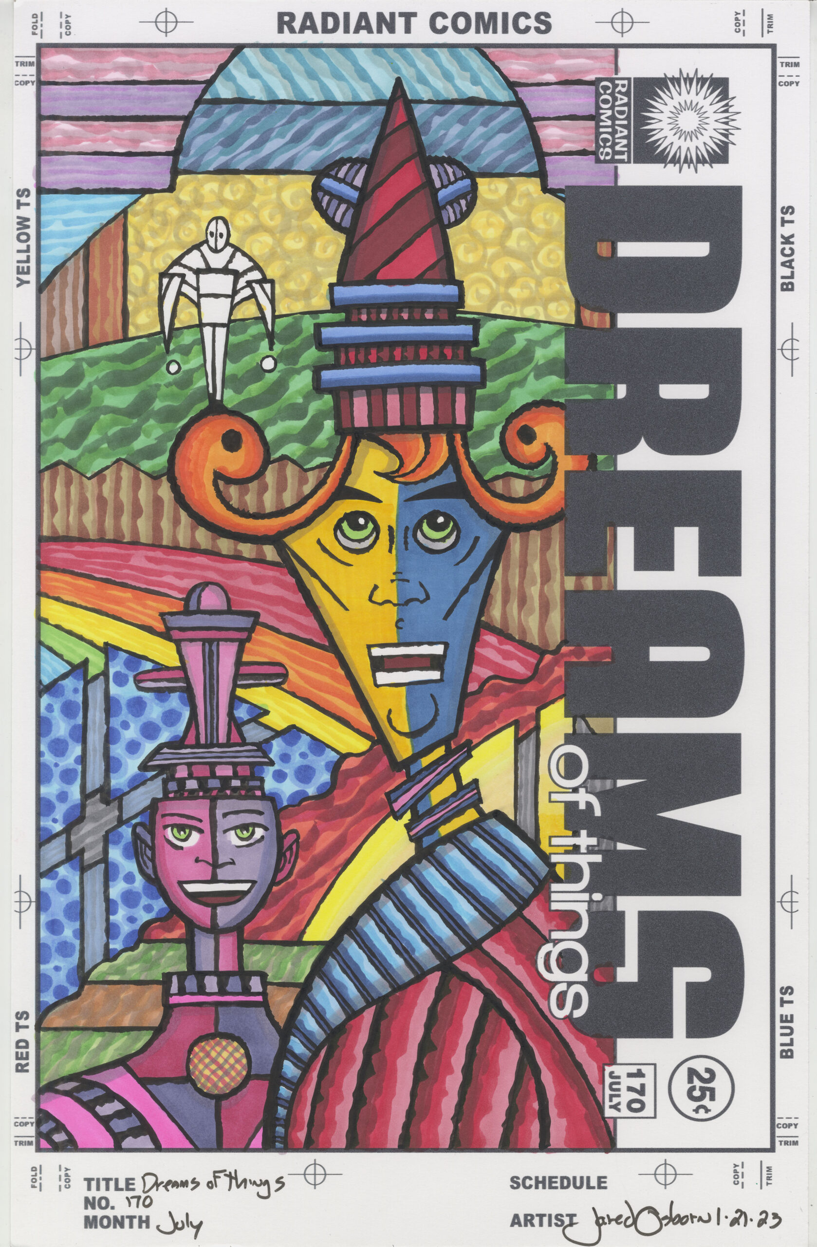
Today was one of those days when I had no drive and no inspiration. I wanted to do something but I was bored and uninterested in everything. I can still get stuff done on days like that because I always have stuff to do that is in various states of finish. So I decided to marker color one of my “Dreams of Things” covers. It is number 170.
The problem was that I was completely bored by how I usually do things. Just the idea of deciding what colors to put down put me off. I always color these pieces with my Copic markers but I started to think of other things to color them with. For a brief moment I flirted with the idea of coloring them with Sharpie markers but then that seemed like it would make the task even harder. I’ve got a few other marker options but none of those were a good idea either.
I often think of making some of these covers with watercolors but the problem is that I print out the logos of the colors right on the Bristol paper that I use and the printer ink isn’t waterproof. It will smear if I get it wet. The Copic markers that I use are alcohol based so there is not that problem. If I switch to gouache or watercolor I have to figure out a new method of handling the logos.
So there I was staring at the inked cover and wondering what I was going to do with it. Normally at this point I would think about the color, the technique to apply the color, and how to organize the color. Maybe I would want some reds on top, blues in back, and purple and green for the main figure. That’s the sort of stuff I’d think about. In thinking about how to apply the color I’d decide if I wanted smooth color, side of the brush texture, or some dappled color and texture. Once I figured out what I wanted where I’d start working. This time I didn’t even want to think about it. I was that uninspired.
That’s when I got the idea to go with that lack of inspiration and try to create some chaotic color. I usually work towards order with my color but this time I wasn’t going to. There would be no thinking about harmony and defining the space in an organized way through the application of color. I was going to put color down in a chunky way with all the Copic markers in my set.
I started with the red stripe in the bottom third of the background. I used three red markers and put the color in with big chunky side of the brush marks. After that I did the same with the green across the top third in the background. Next I put down the big yellow swirls in the background right above the green. None of that stuff worked together harmoniously but that was okay.
I decided to continue with the background before I bothered thinking about the foreground at all. Right in the middle I decided on a rainbow. I started with red and didn’t even care that it ran right into the red section that was already there. Plus it was barely a rainbow as the blue and violet sections were short. But that added to the chaos.
I added blue dots on the left, blue chunky stripes on top, light violet and pink on top, green and brown on the bottom, and some more yellow on the right bottom. I went with whatever came into my mind without thinking about color harmony and there is no color harmony in that background. It’s all disordered and that’s what I set out to do.
The only idea I had for the foreground figure was that they should be the, sort of, primary colors red, yellow, and blue. Usually when I do that I keep those colors out of the background. But I didn’t’t do that this time. There are reds, blues, and yellows all over this piece. It’s tough to tell the foreground from the background. But that’s what you get with chunky and chaotic color. So that was fine with me.
Usually I use color to arrange the space of one of these colors and that brings order to the dream-like image. I didn’t in this case. My eye finds it hard to move around the image and see it. As a matter of fact I didn’t notice until this very moment that I left the little figure near the top in black and white. That’s chaos for you. I think I’ll keep it that way.