I just finished coloring one of my “Dreams of Things” covers. Number 131. I mention it not only because I often write about my art on this blog, that is the point of this blog after all, but because it was a weird one. Yes, all my “Dreams of Things” covers are weird but this one was a different sort of weird.
I like to draw faces. In general I like to make images but one specific type image I like to make over and over. Faces. Not just everyday faces but weird ones, alien ones, and faces with all sorts of marks and designs on them. Not that I haven’t always drawn faces as part of my art but it was probably somewhere around the year 2000 when I started to specifically draw my design heavy faces. I’ve been working on them ever since.
Way back in the mid-1980s when I was in art school one of my teachers made the observation that the people in my paintings were staring at us (the viewer) harder than we were staring at them. I found that interesting. I’m not sure if I could have made that observation on my own.
I still do like to draw faces that are looking at the world with unblinking intensity but now I’m aware of it. Part of the reason I like to draw faces is that through the face the drawing or painting becomes a person. They may not be real but everyone recognizes that there is a person of some sort looking out at them.
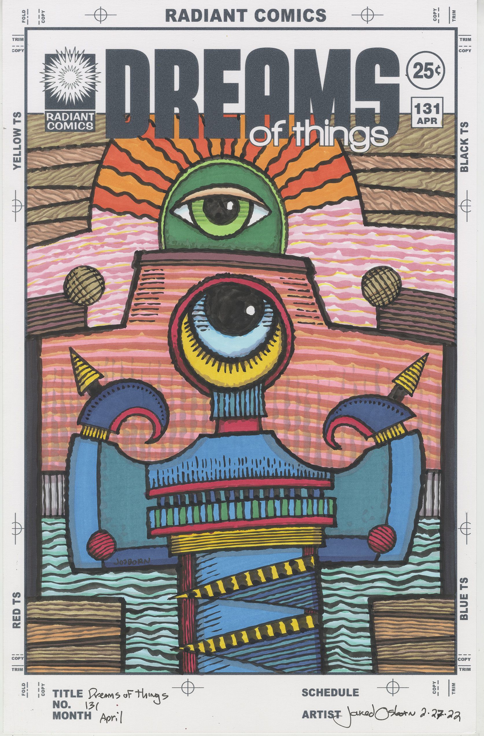
That’s what makes “Dreams of Things” number 131 different form the others. There are no faces in it. Sure there are two eyes but that’s not the same. The eyes are looking at us like some sort of all seeing eye. A god creature stares out us but it’s not a creature we can relate to. It’s a mystery not a person.
This one also has a different sense of color that most of my other ones. It’s very warm but not hot. There are a lot of browns and red based browns going on. Plus a lot of the horizontals are not true horizontals. At least in the color part of the drawing. The horizontal is established in the ink drawing with the fence behind the main figure but all the lines above it are curved. It’s a weird space.
I started the color in this drawing with the reddish sky in the background of the top. It’s a three color technique and I also drag the side of a brush marker across the page to get a rough line. The line kind of follows the edge of the back wall but it’s not symmetrical. It keeps things off kilter. I think off kilter became an unconscious theme of the piece.
The next part I tackled was the wood grain of the top on the left and right. I put down the dark color first and made the lines go in different directions with each new board. I then alternated between a reddish and a yellowish color. That gives the wood a little more visual interest.
I kept the brown theme for the color of the wall with the eye atop it. The brown is a little darker and a little redder than the sky behind it. It also has the same type of horizontal lines in it and they don’t quite match ups with the sky lines. Those two sets of lines are what’s responsible for the off kilter feeling of this piece.
I think this is when I decided to make the rays that are around the top eye orange. I had already decided that the water was going to be a blue green so I knew that the orange rays would probably be the strongest color in the piece. They really add to the “Sun god is watching you” feeling of the top eye. I made the eye and what surrounds it green to give it a lot of contrast with the orange. Green fits in with the earthy tones of the brown around it.
One of the things they teach in painting class is that you should always paint your background before you paint the main figure. That is actually good advice bit it’s often hard to follow. Usually the main figure is the most interesting thing in the painting and therefore is the most interesting thing to paint. That background is often boring. In this one I managed to follow that advice and got all of the background colored before I started on the main figure. I made the fence grey, the water blue/green, and the bottom wood brown. All that was left was the bottom figure.
I’m not sure why but I wanted to keep that bottom figure dark. Or at least middle toned. I wasn’t looking for it to be bright. Since I hadn’t used red, yellow, and blue (the primary colors) in the drawing yet I decided those were the ones I wanted to use. But I didn’t want them in equal amounts. I decided to mainly use blue with accents of yellow and red. That would keep the figure from getting too bright.
I keep calling that thing on the bottom a figure but it’s not really a human body. It kind of looks like a human body with both arms raised as if it’s flexing its biceps but that’s a stretch. Without the eye and those claw-like hand things it might not resemble a figure at all. It depends on our mind’s unconscious ability to find human forms in all sorts of stuff.
I think I got the right amount of yellow and red in the figure, It definitely reads overall as a blue thing but the yellow and red make it stand out form the background and come alive. The yellow outside the eye also makes it stand out. It’s the part that moves forward in space the most.
The last thing I added are the vertical color lines on the wall behind the figure. I wanted a little more texture in back and something to break up the relentless horizontals. Those lines made the space even weirder. They stand up in an unnatural strange way.
Weird, strange, and odd are words than can describe most of my “Dreams of Things” covers. That I made an especially weird one is an especially weird thing. Weird.