Dreams of Things #113
I just finished my 113th “Dreams of Things” piece in my “Comic Book Covers That Don’t Exist” series. My method to get one done is to draw a cover in pencil, scan in that pencil drawing, set up the logo and trade dress digitally on the drawing, print out the drawing and logo on an 11×17 inch piece of paper, ink the drawing, and then color the drawing with markers. I do these steps in stages and the last stage is the marker coloring. That’s what I just finished on this one.
I made my very first “Dreams of Things” cover back in 2012 and before it became a series of drawings it was a way for me to use a couple of the simple dream-like images I drew and turn them into something finished. I think the first few I made were smaller than I do them now and I didn’t marker color them. It was a bit later when I decided to make them into a series of 11×17 inch color drawings that they got bigger and colored with marker. I even redrew the few earlier ones to match my new idea about them.
The reason I have for telling this story is to point out that in the beginning the drawings were fairly simple. That was the point of them. They would be about a single face or figure drawn in a dream-like way with a lot of graphic design to them. Stripped down design. But, of course, as time passes and I do a lot more of them things change. Some of the drawings over the years have gotten complicated. Maybe too complicated at times.
For the last three or four drawings in this series I tried to strip things down a bit and base the drawings around a single face. I usually do big faces with decorative marks on them. There is usually a lot of black and white design in these faces and therefore the color tend to be simple. Not a lot of shading but some carefully chosen simple colors with some other color patterns in the background. It’s been taking me about four hours to color one of these drawings. But then came #113.
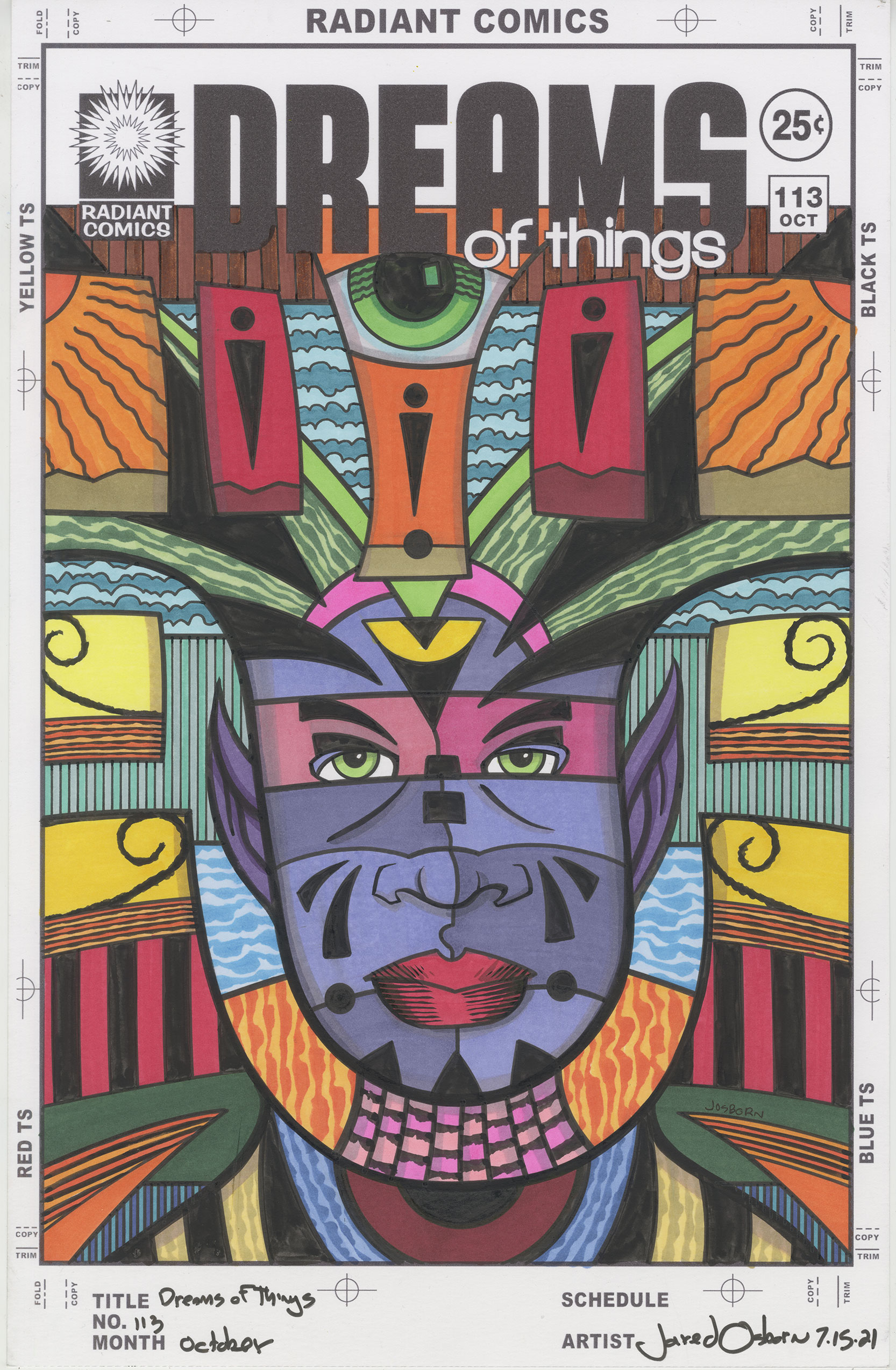
This “Dreams of Things” cover tricked me at first. The drawing looked like some of my other current ones. There was only one big face in it. But the space around the face was much more complex. There were signs, symbols, and strange areas on this one that needed to be defined but the color. Often I do most of the defining of the space of a picture in the drawing stage. But with this one I didn’t.
One of the techniques of making art is to start with the background first. There are many reasons for that but in this case it was because I wanted to delineate what kind of world the face existed in before coloring the face. I knew that had to come first.
The first thing I did was to color the two types of clouds in the background. Up top I have two shades of blue separated by a black line. Behind the head, in the middle, I have to more shades of blue with no black line. Two different sky techniques to keep things interesting.
The second thing I did was color the suns and the spirals. The sky is all the way in the back but the suns and spirals were all the way up front. I went with yellow and orange to keep things lively and literal. For some reason that made me see the two rounded rectangles on top and the stripes beneath the spirals in red. I then brought the orange color down into those two side triangle on the bottom.
Next I had to figure out what to do with the face’s neck and fake shoulders. It looks like he’s standing in front of a carnival sign and sticking his head onto another body. I decided to keep a lot of color contrast between the neck and the fake shoulders. I think it works well and makes what could be confusing into something clear. Orange and pink for the neck and dark red, blue, and yellow for the fake shoulders.
The last things in the background were the green “Hair,” the stripes behind the face and the stripes on the bottom. I keep these fairly neutral and made them blend in with the rest of the art. I also put a little more yellow onto his forehead. I had each and every one of these colors figured out and laid in before I go to the face.
I decided to save purple for the face as I was figuring out all the color. But I didn’t want a single color purple face. That’s when I decided to split the face up into ten parts. The slice the eyes are in became two different magentas to make them stand out from the face and the rest of the face became four different purples with a little bit of shading thrown in for a little bit of roundness.
The lips are red because one of the things I’ve found when making face drawings with weird color faces is that it’s helpful to keep the lips red. It anchors and grounds the face. I don’t always make the lips red but I do the vast majority of times.
The color on this one got very complex on me and I think it took about six hours rather than my usual four hours to complete. Often when I start a “Dreams of Things” drawing I can see some, if not most, of the colors in my head before I start putting them on paper. Not with this one. I had to think about an area, chose a color, and then think about what color I wanted the next area. That took a while. It may have taken me the longest time to decide to make the big eye on top along with the eyes on the face green. I don’t know why those were the two hardest spots but that’s how it worked out.
I’m really happy with the way this one turned out but ,for me, it was a long and winding path top get there. I’m glad they’re all not this much work.