I like making prints out of some of my art. Some of my art is also made to be a print. These are the pieces that I digitally color and then make a print of. They are not finished until they come out of my printer. Unlike my stuff made with paint or marker there is no color except digital color with these prints. Though I like the way they come out I find the process of coloring digitally a bit tedious.
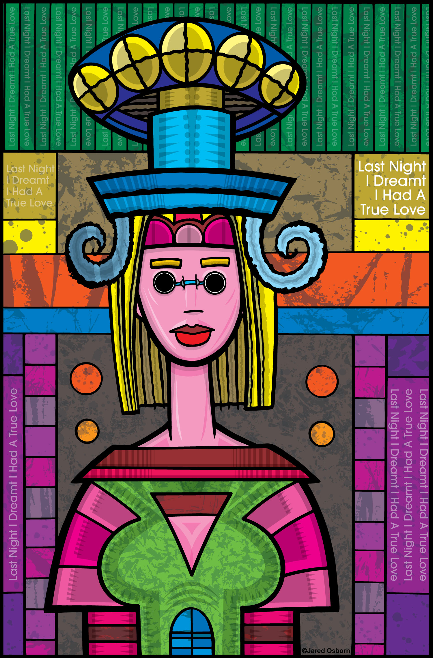
For the last few weeks I’ve been working on a print series that’s called, “Last Night I Dreamt I Had a True Love.” It’s a series of very colorful female figures with the title as type worked into them. I like type and images. I created the series last year (2024) but only finished a few prints in the series so I decided to work on getting more of them done.
They start, as most of my art does, on paper. I look through one of my Inkbooks (which are filled with small ink thumbnail drawings) and find some images that I want to work with. I blow them up to 6×9 inches and print them out in blue line. I then draw over the blue line and make a finished pencil drawing and scan it in. This pencil drawing is blown up and printed out on an 11×17 inch piece of Bristol board. I ink over that blue line and make a finished ink drawing. I scan that ink drawing in to be digitally colored.
When I know a drawing is going to be digitally colored I make it slightly differently than normal. I make sure all the shapes are closed off. Sometimes when making a regular drawing some of the lines stop before they hit another line in the drawing. There is a small gap that can let the line breathe. This gap can cause problems depending on the digital coloring method. I’m going to color my prints in Illustrator so closing all the gaps will make things a lot easier. So I make sure that I do.
Sometimes I scan in Bitmapped mode and sometimes I scan in Greyscale mode and then convert it to Bitmapped mode in Photoshop. I scanned in greyscale this time so that I could play with the threshold in Photoshop to get just the conversion to Bitmap that I wanted. After that I bring it into Illustrator and image trace it using only two colors. This converts the drawing into a vector drawing. Once it’s a vector I put all the black lines on one layer and the white shapes to be colored on another layer. Now I’m ready to color.
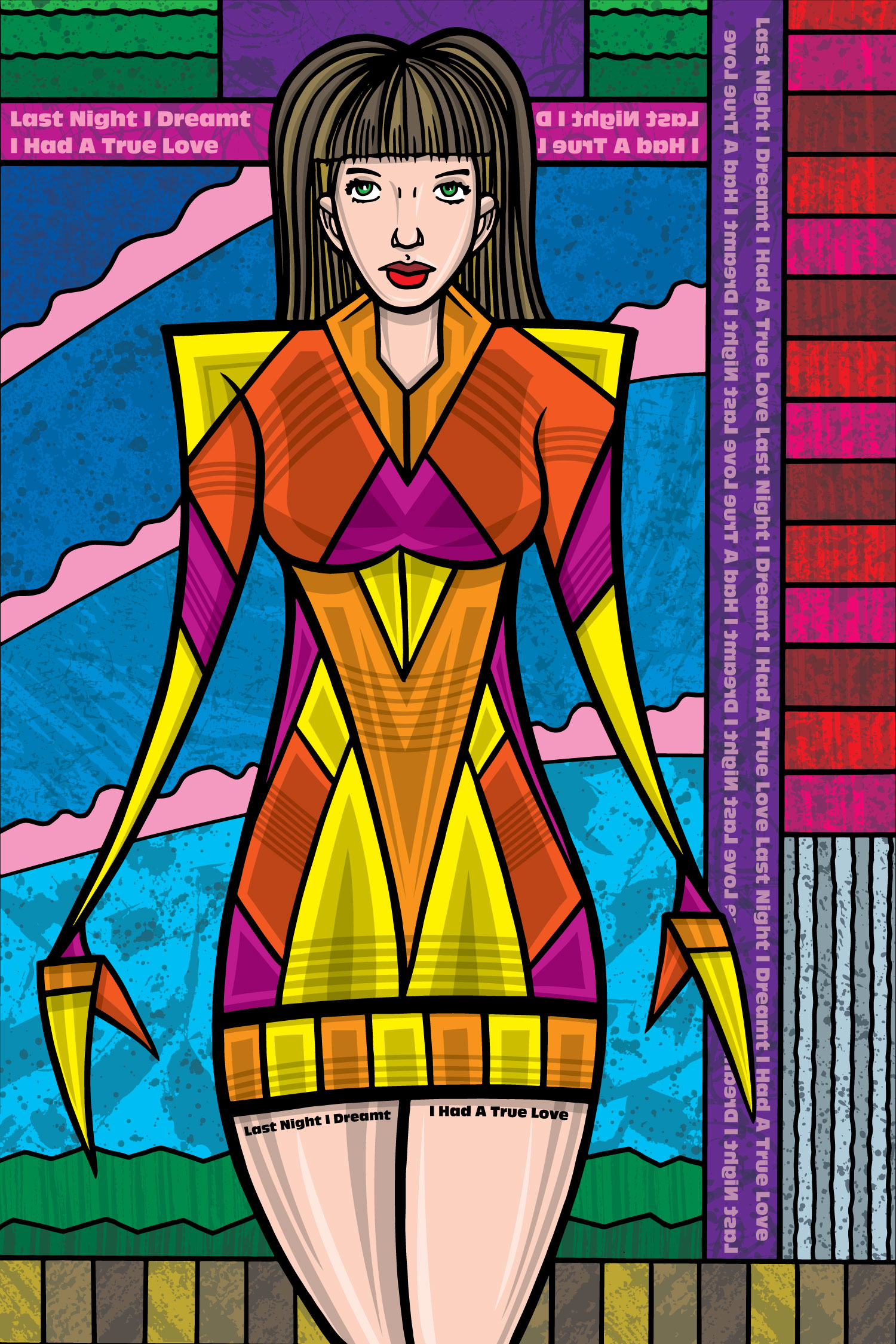
Now comes the part where I start thinking about color. Nothing is tedious yet so this part is okay. These drawings have a lot of shapes in them. I have to figure out what color each of these shapes is going to be. It’s not based on realism either so it’s not just that leaves are green, the sky is blue, and fire is red. I can make anything any color and with that freedom comes a lot of choices.
Usually I start like artists have started for hundreds of years. I figure out the values before the color. The values are how dark or light something is. Sometimes I do this in greys and sometimes I do this with different shades of a single color. I did this one with a single color. I think it was red. I made swatches of eight other ten different dark, medium, and light reds and used these colors to fill in the drawing.
Using this method I get my darks and lights on point. After I have that figured out I group the same color together so I can change them all at once. Everything that is Red #4 gets chosen and grouped. Now if I want to change everything that is Red #4 to yellow all I have to do is click on one Red #4 shape and it chooses all of them. Then I click on yellow.
Now is when I figure out the base colors. With all the values chosen it’s a lot easier to do. And it’s easier to try out different things. This part takes a while but it’s not tedious. Anytime I’m using my brain is a good time.
The next step is when things start to get a bit tedious. Now is when I start the shading. It’s not even your typical dark to light shading because I’m using shapes of cut color with no blending. What I do is set up a shading layer and do the shading on that.
The shading on these pieces is done by drawing a shape over top of the shape that’s there. Of course not the exact same size but smaller where I want the color darker. I use the pen tool to draw the shape and it’s a very exacting process. Each little shape in the drawing has to have its own shading.
A note on the color of the shading. Here is where I do something that I would never do with real life paint. I use grey to shade the color. With real life paint this would mess up the color. With a digital print and this limited color it works fine. The shapes I put down are either a 25% grey set to multiply (a way to blend it in with the color beneath it) or a trio of light colors that look grey (also set to multiply). With this method I can change the base color without having to change the shadows. They just blend in with the new color.
After the shadows are in place I put in some highlights. There are fewer of these and they are in color, not grey, and depend on the color below them. If I change the color below them then I have to change them too. That’s why I usually save the highlights for last.
Shadows and highlights are the tedious part of this method. Plus they take a while. I spent a day doing the base color and then a day and a half more day on the shadows and highlights. That’s the tough part. All that figuring out and drawing of the shapes takes time and not a lot of brain power. It’s a lot of reacting rather than acting.
The last thing that I do is add textures to the background colors. This doesn’t take a ton of time. I have made a lot of textures and they are set up to easily be dropped in. I choose my shapes where I want the textures to go and then use those shapes to make a clipping mask. That mask blocks the texture outside of the shape. So all the textures are in the right places. Preparation of the textures ahead of time makes this part easy.
The textures not only add visual interest to the piece but they take the edge off the tedious part I just finished. That’s always a good thing.