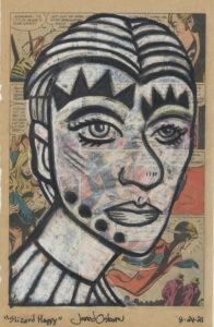
Slizard Happy
I’ve been working on some drawings in my “Art on Comics” series this week. It used to be called my “Monsters on Comics” series because I drew a lot of monster faces that way but this week I felt like drawing regular faces and not monster ones. Or at least faces as regular as I draw because in the end they tend to be pretty weird faces. I add markings and strange features to them to make them more interesting to me.
I originally started drawing on pieces of paper torn out of comic book many years ago. It was because, as a comic book fan, I have a ton of worthless comics sitting around doing nothing but waiting to be gotten rid of so I decided to do something with them. I tried many ways of drawing on them over the years and have found one way that works for me.
First of all there is the paper of the comic book. I like to draw on the old newsprint of 1970s comics better than the slick and glossy paper of today’s comic books. One day I was at my local comic book store when the owner was throwing out some battered and worthless comic books. He had recently bought a collection and these were the super crappy books that he couldn’t ever sell. But they were good for my purpose: tearing out the pages and drawing on them. So I took home a stack of about 25 comics that I could use for that purpose.
Those comic sat in an untouched pile for over a year because I didn’t do any drawings on comics. That was probably because I had only mostly done monsters on them up until that time and if I didn’t feel like drawing monsters I didn’t bother drawing on comics. That was until this week. In the past I had drawn a couple of regular faces on comics but not many. As I didn’t want to draw monsters it struck me to revisit my other faces as drawing on comics. That got me pumped up.
When I did my first drawings on torn comic book pages I used white conté crayon and charcoal. The white conté crayon worked fine but the charcoal didn’t. Old newsprint is delicate and I had to press too hard with the charcoal to get it black enough. I ended up switching over to a black marker and that worked well. These days I use a black Copic brush marker. It’s number 110 and is called “Special Black.” I think it’s supposed to be more of a matte black than other markers. It woks well on the paper and with the white conté crayon.
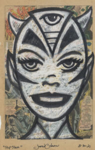
Slip Slam
The white conté crayon I used had been sitting around my studio since the 1990s. It was old. After I used it up I tried to replace it. I bought the same brand and softness but when I went to draw it wasn’t nearly as soft as I needed it to be. It was too hard and I had to really press with it to get the white going. Not good. After that failure I went on a search to find something to replace my old white conté crayon. I tried other brands, white charcoal, and anything else I could find. In the end it was a white pastel that finally did what I wanted it to. That’s what I’ve used ever since.
When making a “Monsters on Comics” drawing I used to sketch out the monster face either on a small piece of paper first or with the black marker right on the torn out paper. I tried drawing with the black marker right on the paper but I didn’t like it this time. There wasn’t enough contrast between the black of the marker and the printed comic book page. I switched over to drawing the initial sketch with the white pastel and liked it better.
Here was my method to draw these faces on comics. First of all I worked on four of them at once. I found it a little more interesting that way. Sometimes I like switching between things because it keeps me more interested and focused. It can also be satisfying to finish a few things at once. Finishing one drawing can be less impressive (even to myself) than finishing four drawings that I can look at and compare and contrast.
I grab my box of white pastels and grab a stick. I then sketch out a face. Sometimes the look of a face pops into my head and that’s what I draw but that doesn’t always happen. My second method it to look around at photos or some such and see if I can find a face that interests me. Sometimes it’s just a head shape, haircuts, or a single facial feature. I uses one of those to get started. The third method is to put pastel to paper and draw. I put down marks and react to them.
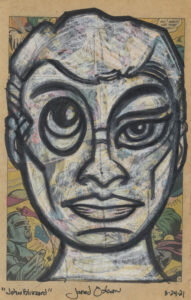
John Blizzard
This morning I decided to draw all four with their steps synchronized. Often I skip from drawing to drawing leaving them at different stages but not today. So I first made four head sketches in white and then moved onto step two. That’s when I take a black brush marker and draw over the white sketch in black. It’s not the final black line yet. Just the first. I did this four times on the four drawings.
Step three is to fill in the face with white. It doesn’t have to be perfect but anywhere that’s not black will get some white pastel. I did this for all four drawings and then picked up an old dried out black brush marker. I used the dried out marker as a blender with which I blend the edges of the black ink with the white pastel.
After step three is when all the work happens. After blending there is always an imbalance between the white and the black. So I go back in with the black marker, blend again, add some more white pastel, blend again, and keep doing this many times until I get the drawing I’m looking for. All the other steps are in preparation for this step. This is when I often switch between drawings. It helps me to see what’s going on as I get a fresh look at one after working on the others for half an hour.
It took me from 8AM until Noon today to finish four drawings so that means they take about an hour a piece. That’s not bad. Sometimes I find it fun to have a technique that’s fairly quick and I can get a bunch of images made. When working on the stuff that takes a lot longer it’s key to have an image that I like and want to work on. The quicker drawings give me a lot to choose from. I like that.
The last step with these drawings is to hit them with some spray varnish. Pastel is a powder and will make a mess of things as time goes by. The spray varnish keep the pastel in place. A side effect of the varnish that I like it that it makes the white pastel slightly less opaque. The print of the comic book shows through a little more than when it was unsprayed. I think that makes it look a little better. I’m always good with making things look better.