Comics I Bought This Week: March 8, 2014
I’m back from the comic shop this week and I got seven new comics and a graphic novel.
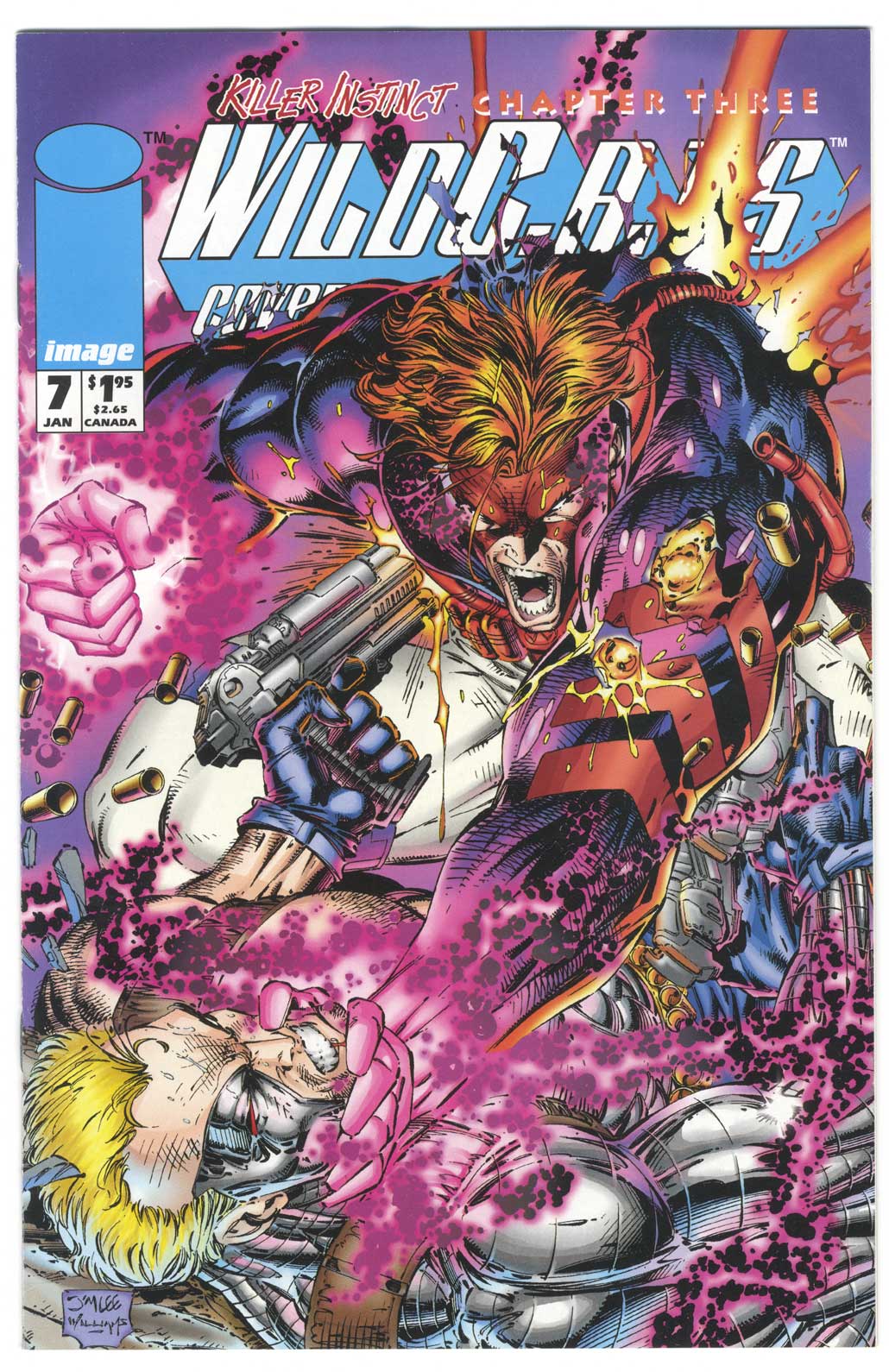
This week’s comic book cover to look at and examine is “Wild C.A.T.S.” #7 by Jim Lee and Scott Williams. I’m not sure if I picked this one up off the stands or got it a little bit later. I wasn’t a big Image comics guy back in the early 90s and it probably wasn’t until six months or a year after they launched that I bought any Image comics. Then I started buying a few of them regularly and got the back issues of the stuff I missed.
I’ve never been a huge fan of Jim Lee’s work or a lot of stuff from that super-hero period of the 1990s but I figured I’d give the man his due. He does some nice work even if it’s not always up my particular alley. Here is a fun and over-the-top dramatic cover. It’s crammed with everything he could shoehorn in there and I appreciate the effort.
This is one of those covers that reveals things the more I look at it. At first glance it’s about the struggle between Spartan and the blond guy (sorry I can’t remember his name) with its main axis being Spartan’s arm as he thrusts his hand under Blondie’s chin. My eye travels up and down the arm between the two faces. It’s only on second glance that I notice Spartan is being shot and his back is being blown out. That and I notice Spartan’s second glowing pink hand. And it’s only on third glance that I see Spartan is being shot by a second gun on his other side. That’s a lot going on as part of a secondary struggle.
This is some early computer coloring and a lot of that can be cheesy but I like it on this cover. It fits with the chaotic nature of the cover. It’s mostly pinks, reds, violets, and blues and achieves a sort of harmony without bringing the chaos under control.
The drawing is pretty chaotic here too. Lots of energy crackle mucking things up and forms that are half destroyed. Even Spartan’s arm, which is the main compositional element of the piece, isn’t intact. Plus the logo is destroyed. There may be a little too much teeth gritting for my taste and Spartan’s weirdly opened mouth makes me say, “Huh?” but those are taste issues and don’t have to do with good or bad. Overall I like this cover and think it’s a good one. Not just by early 90s standards but by any.
Discussion ¬