I’m doing something a little unusual today in that I’m writing about a piece of art that I just finished. I literally finished it under five minutes ago as I sit down to write this. I think I’ve written about stuff that I’ve finished the day before or maybe even the same day but not five minutes later. It seems kind of strange to sit down and write with no contemplation time. I guess this is the contemplation time.
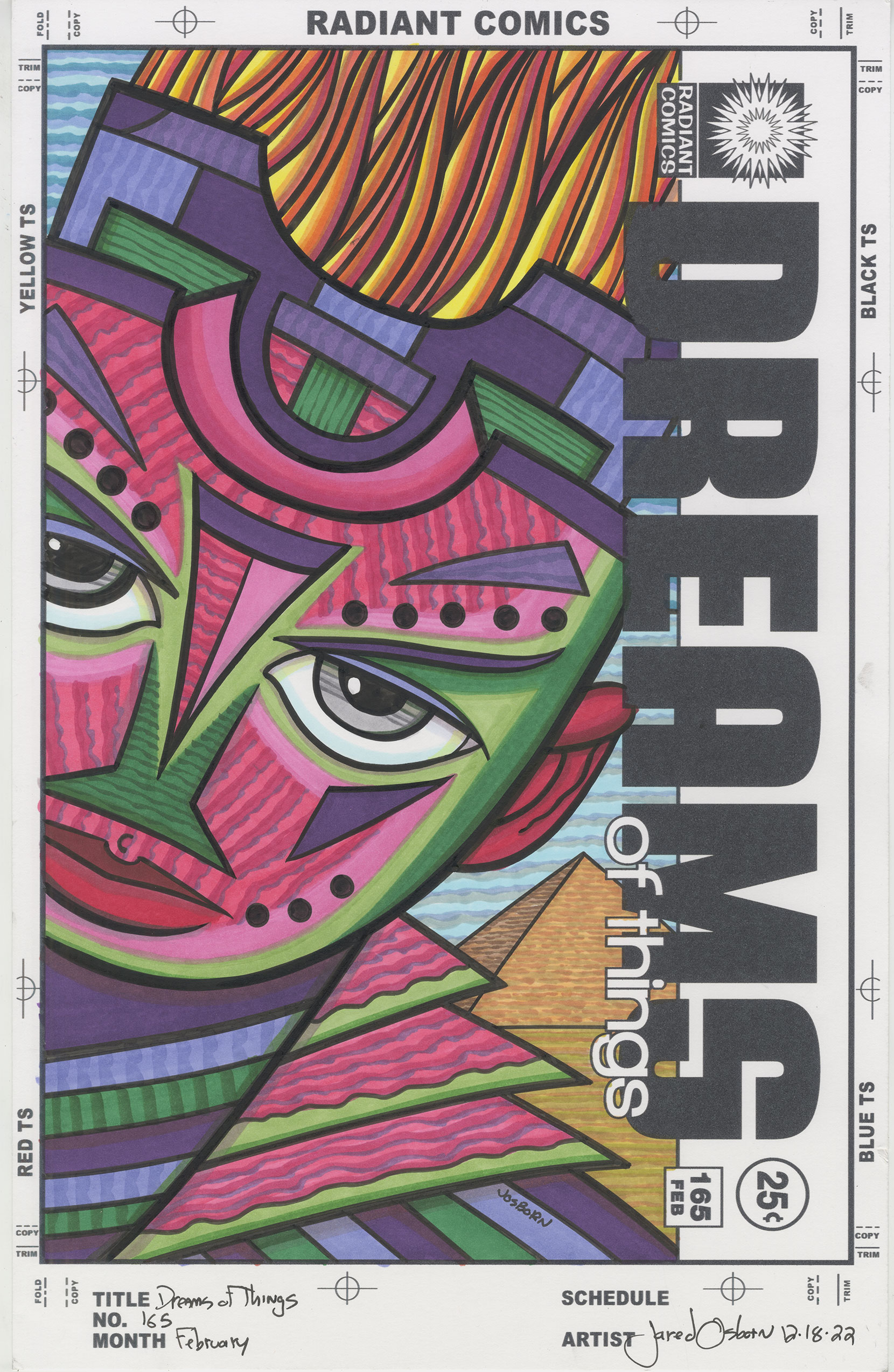
This piece is another in my series of “Covers to Comic Books That Don’t Exist.” It’s “Dreams of Things” number 165. I just finished the marker coloring on it. It finished the inking on it two weeks ago. It’s strange because last week I went to marker color a cover, picked this one up off the pile, realized I had skipped over cover 164, went to look for 165, and found that I had never inked #164.
It wasn’t any big deal that I had skipped #164 in that I could always marker color #165 and then get back to #164 but for some reason I felt the need to do them in order. I’ve done these covers out of order many times before but this time that seemed undoable. So last week I inked #164 and then marker colored it the same day.
With this one (#165), as I often do, I worked on the background first. In this case it was easy to start that way because there isn’t much background. I went literal with it too. Though there are two sections of sky, one on top of the other, I went with the color blue for both of them. Three stripes of color make up both skies.
After the sky I colored the pyramid and the ground. I kept them both close to reality. The pyramid is a brown that makes it look like some kind of sandstone and the ground looks brown like sand. The brown of the pyramid has a reddish tint to it but I gave the ground a greenish tint. They also both have lots of vertical lines in them to match the sky.
The next thing I colored was the flaming hair. I decided that it should be orange but I wanted some dark reds in there too. This part was probably the easiest part of coloring the piece. I used two sets of stripes of red, orange, and yellow and then blended them at the end. In terms of technique and color choice this part was easy. I wish everything was as easy to do as this was.
I had a problem after I did the hair in that I had no idea what I wanted the color of the face to be. Usually colors suggest themselves to me as I’m thinking about a piece but this one wasn’t giving me much. I finally settled on a dark purple and picked the darkest purple that you can see in the piece and started with that. I filled in where I thought the darkest purples should go. After that I dropped in two more purples.
One thing that I decided on when contemplating this drawing is that I would have sections of the face where color butts color with no black line between them. I don’t usually do this but within the wide open areas of the face I wanted a little more color variety than I would have if I stayed in the lines. Instead of having one flat color I ended up with two magentas and two greens making a really weird combination.
The first face color that I put down was the lighter green. I outlined the outside of the face and eyes with it and made some shapes that followed the general contours of the features. I don’t usually draw in color like this so I was flying by the seat of my pants. After the light green was in I drew in a darker green.
It was at this point that I decided to pair the greens with magentas. This is a weird choice for me and not a pairing that I’ve worked with a lot. Magenta and green are contrasting colors and stand apart from each other rather than blend together harmoniously. But it was a strange face with a lot of open space in it that didn’t lend itself to shading so contrast was my choice.
First I put in the light magenta much like I put in the light green and then I filled in what was left with the darker magenta. A little marker tip for you since it helped me lay down these face colors. When using markers use them like you would brushes loaded with paint. Think about your brush strokes and the direction of them. Follow the form of the drawing with your markers. Never scrub color in with the markers but instead fill areas by following the form and then hatching across the form if you want the color richer.
I added a little bit of shading around the edges of the form and colors but if was here when I decided to use stripes of color in the magenta. I thought that it needed a pattern to give it more visual interest and since the magenta ended up being the dominant color that’s where I put the pattern. I used a darker magenta and then a purple to make the side of the brush jagged stripes. I added a few stripes into the green where I thought it needed it.
At some point during all this I thought that the eyes should be grey. I rarely make grey eyes but here it made sense to me. I added light blues, reds, and yellows to the white of the eye to not have it be so glaringly white. The eyes were one of the last things I colored.
So there you have it. The one hundred and sixty fifth of these covers that I’ve made. That number is getting pretty big. I’m going to have to put them all in a book one day. We’ll see.