Ink Dreams #1
I’m ending the year 2021 in a similar fashion to how I started it. I’m working on some color ink drawings. Back in January through March of 2021 I bought an art supply that I have never used very much. Color ink. I’ve been using black India ink for decades and occasionally used a color ink here and there but I never developed a style with them. When I used color ink it was usually just one color and I used it just like black ink. Or I thinned it out and used it like watercolor.
At the beginning of the year I worked on a bunch of color ink drawings ignorer to come up with a new technique. They were mostly small, 9×12 inches and under, and they were mostly made up of multiple stokes of different colors. I wasn’t going for realism or even simplicity. They were all about building up a complex line drawing with many brushstrokes of color. In the end I thought they were okay but limited.
One of the roadblocks I ran into with the color ink drawings was their lack of surface. Ink and paper are totally flat. When I’m making a painting with acrylic paint and canvas the painting has surface. That’s how thick or thin the paint is and how the paint is applied to the canvas. That is a huge part of painting. The surface of the painting affects how it’s seen. An artist has to manipulate the surface to get what he or she wants.
In my book surface is the difference between a painting and a drawing. A painting has surface and drawing doesn’t. Even when the painter chooses to make the surface of his or her painting smooth and level that’s a choice. It takes technique and craft to make a painting “surface-less.” With a drawing that happens naturally because ink, pencil, or whatever sinks into the paper and doesn’t build up on top of it.
Scent Armor
When I was making the ink drawings at the beginning of the year I eventually reached a dead end. I didn’t love the technique but I also didn’t hate it. I thought it just wasn’t there yet. And it made me want to paint. I missed the sense of surface. That’s when I bought five 24×36 inch canvases and spent the summer (and part of the Fall) painting them. The ink drawings were swept aside.
I finished the last of the five paintings in mid-October. It’s a lot of work to make one of those painting. Each one takes about a week. So I was burnt out on painting by the time I finished the fifth one. Plus with a bunch of paying work to do and the Holiday season right around the corner I had no energy or ambition for anything big. So I spent most of my time working on smaller things. Mostly my “Covers to Comic Books That Don’t Exist” series plus the Paste-Up Mash-Up cards that I recently invented.
After a while I got bored doing the same sort of stuff over and over so I looked for something else. I like to skip around from medium to medium so this wasn’t unusual. That’s when I got it in my head to jump back into color ink drawing. I don’t think I touched the inks from about July to December so they were fresh to me again.
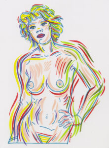
Hypno-Love Girls #16
I didn’t feel like making a new pencil drawing so I decided to look through my vast archive of drawings that I’ve made over the decades. I have then all scanned in and digitized so I can easily look through them on my computer. I picked one out, a nude drawing of a woman, and printed it out on a 9×12 inch piece of drawing paper. Then I got to work with my color inks.
I started with the 9×12 inch size because I remembered that the in drawings seemed to work best at that smaller size. But after doing the drawing I felt constrained by the small size and so decided to move up to an 11×17 inch piece of paper. I think doing those five 24×36 inch paintings made me more ambitions about the ink drawings. I think I was more tentative in the beginning of the year but now wanted to open things up more.
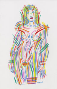
The second drawing was also of a nude woman and I think it works better at the 11×17 inch size. The color and brush strokes are both bolder. Overall I think the drawing has a better flow to it and is more impressive.
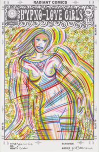
I decided to keep working at 11×17 inched and so that lead me to the idea of reworking one of my faux comic book covers. I made about 15 “Hypno-Love Girls” covers over the years but I haven’t worked on one in a while. That’s because they were middle of the road quality for me after I finished them. I always liked the concept but the execution wasn’t there. I was never sure what was missing from them. So I decided to try making one with color ink.
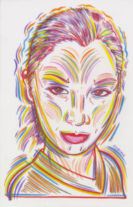
Tanya Dakin Portrait
I still don’t think it’s 100% there yet but I think it works better than the one in just black ink. The drawing is much livelier and fits the “Go-Go” theme better in my eyes. I’m going to keep working on this series.
After that I wanted to do a portrait. I dug out a drawing I did back in 2009 of model and photographer Tanya Dakin and blew it up on an 11×17 inch of paper. Then came the brush and color inks. I like the way this one came out. I think this is a good technique for portrait drawing. The multiple color brush strokes give the drawing a feeling of energy and life. This is my favorite of the ink drawings so far.
The last color ink drawing I did was another of my faux comic book covers. The Enigma Prism #4. This one presented me with a lot of lines in the clothing outside the figure and empty space inside. It started as sort of a reverse silhouette. At first I was going to leave the inside of the figure empty but as I went along I knew I needed something in there. I went with a lot of thick brush strokes that almost become objects.
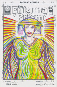
Enigma Prism #4
I’m not 100% sure of what I think of this one. It’s different than the others and in some ways it’s a success but in others it’s a failure. I almost like it. The problem is that I have no idea what I could have done differently to make me really like it. It’s solid but not spectacular. The Tanya Dakin portrait is much more spectacular. Maybe because it was a better drawing in the first place. It’s tough to figure this stuff out when trying a new technique.
So there it is. My end of the year work. It harkens back to the beginning of the year but has a little more skill to it. We’ll see if I can totally crack this nut next year.