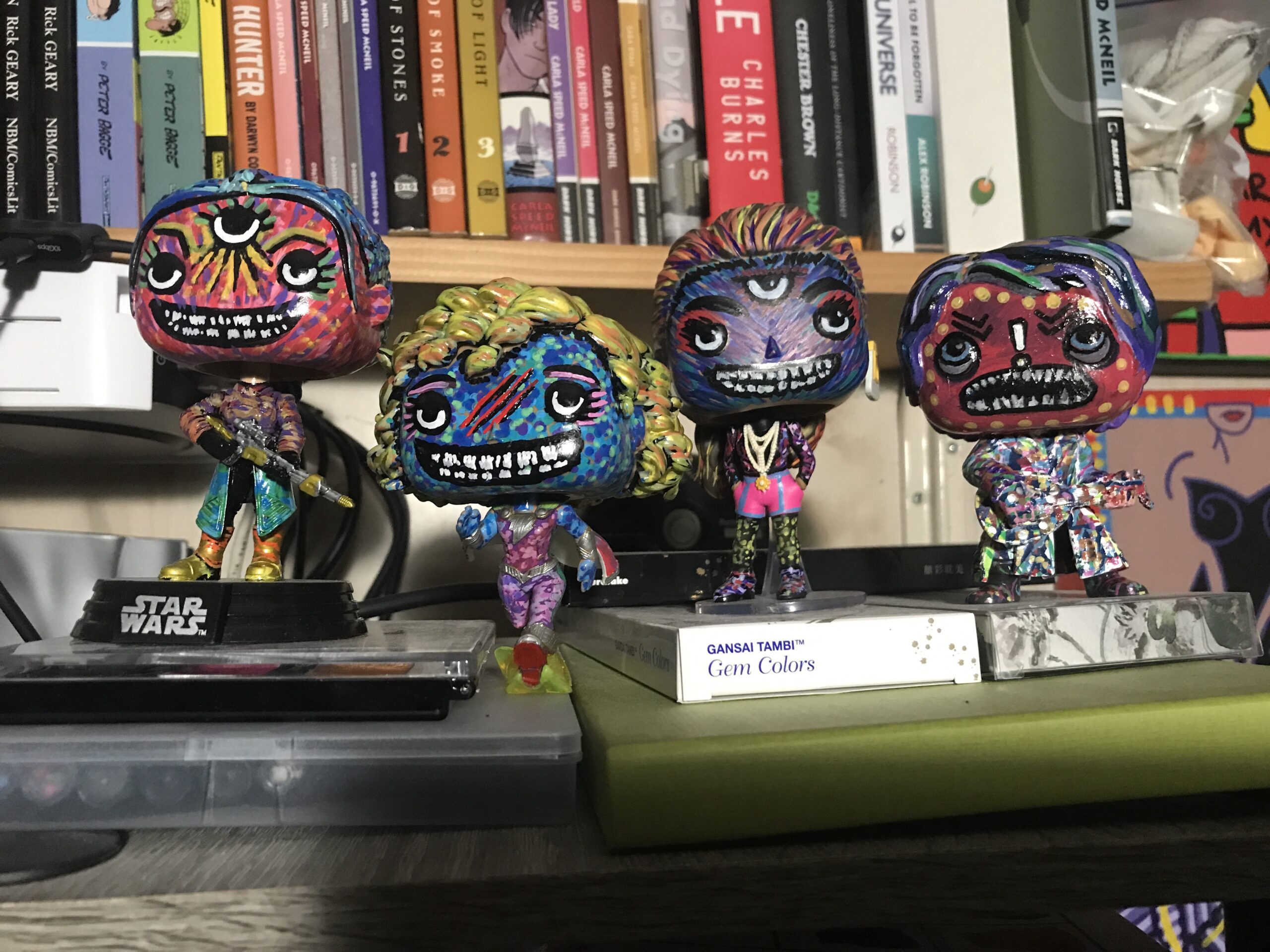
A month ago I wrote about painting Funko Pops. I had painted the first one back then and had no idea what I was doing. Since then I have painted three more and now have much more of an idea of what I’m doing. Both from the physical painting side and from the conceptual side.
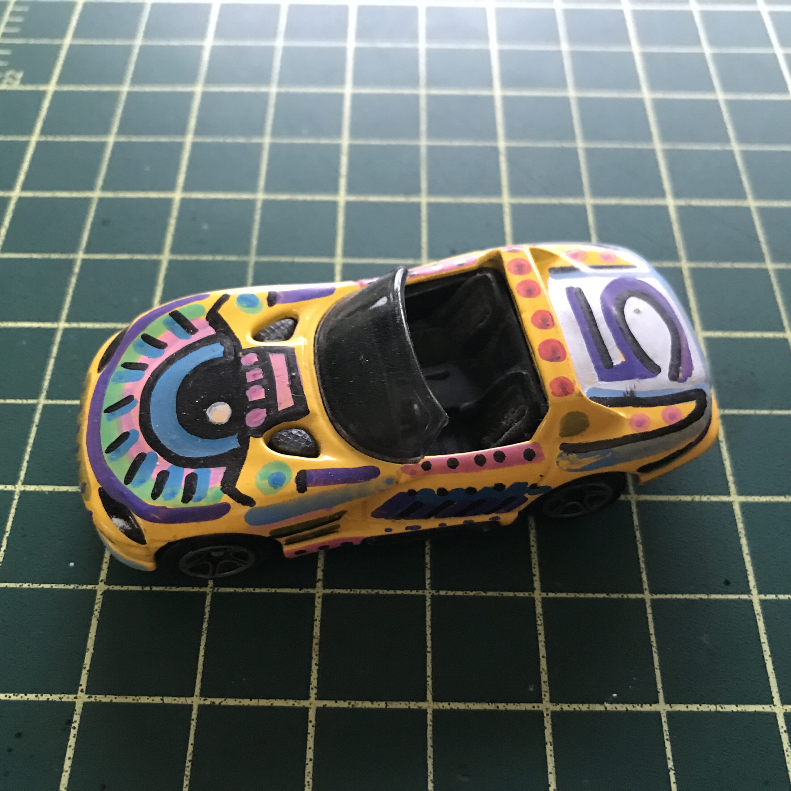
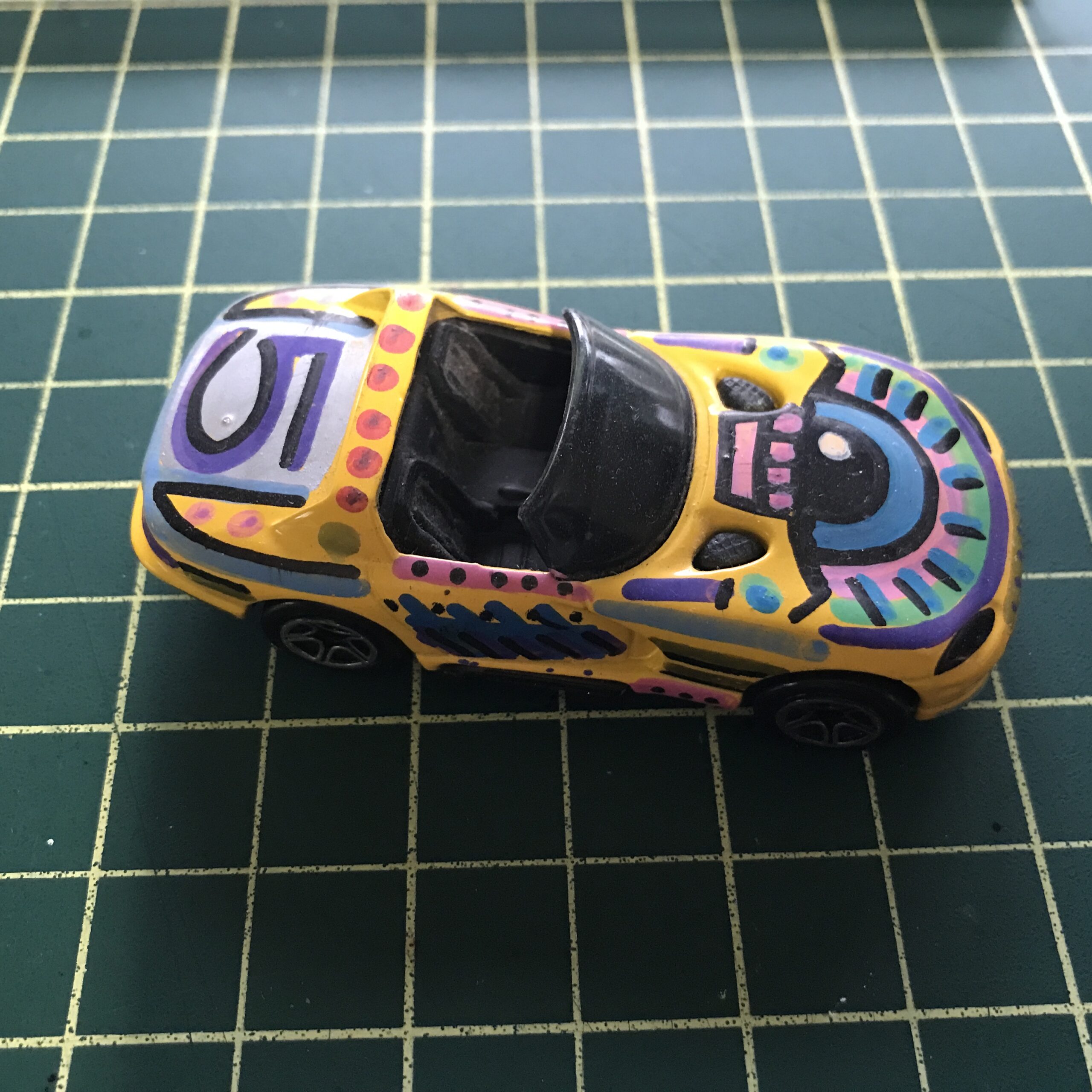
On the physical painting side I’m no longer priming the Pops before I paint them. I only did that for the first one (I painted the whole thing white) but for the next three I just painted right over the color paint. It turns out that the acrylic paint pens that I’m using are opaque enough to cover most of the original paint.
I’ve also learned to use small brush strokes of color and build up texture and a new color pattern as I paint. The small brush strokes of color give good visual interest to the Pops. They look a little like Impressionist paintings with a strange inhuman quality to them too. I’ve also been painting black mouths on all the Pops with crooked white teeth in the blackness of their mouths. They’re creepy looking little Monster Art Pops.
I also stumbled unto why I have been painting these Pops. At least there was a subconscious connection to a past museum show that I now remember. As I’ve been painting these pops I’ve been putting them on a shelf that is fairly high up in the air. It’s slightly above my eye level. I mention this because sometimes I glance over in that direction and the Pops startle me because I don’t expect them to be there. That and they look creepy.
I think I’ve succeed in making them look weird and scary. Especially in the low light. Sometimes when I’m turning off the lights in my studio and glance over in their direction they creep me out. It’s like a Twilight Zone feeling looking at those grinning little Art Monsters. It makes me want to do more of them. Plus it triggered a memory.
Flash back with me to the 1980s. Specifically it was the Spring of 1988 and I was in my senior year of college. I was in art school and I had a class called “Visiting Artist Painting.” As part of some New York State art grant the artist who won the grant would have to teach a class at a state art school. The visiting artist changed from semester to semester but that semester the visiting artist was Emilio Cruz.
Emilio was a terrific teacher. I had a good time in that class and learned a lot. Often for the first part of class he’d sit and talk with us students about art, culture, and whatever else was going on. It was a Friday class (our classes were all day long) and I remember always looking forward to the end of the week and his class.
Emilio also took us on a trip to the Brooklyn Museum one Friday. The school was in Westchester NY and had big vans that we could use to take trips into NYC. So that’s what we did. There were probably about eight to ten students in that class and we piled into the van and drove to the Brooklyn Museum.
The show he was taking us to was about the art of New Ireland (New Ireland Wiki). That’s an island in the South pacific that has a long tradition of making art. Emilio did a great job of telling us all about the art and how the people of New Ireland lived with art in their everyday lives. It was an essential part of their existence and they had various pieces all throughout their homes. It was a good show with a good teacher.
There is one piece that stood out to me and still stands out to me in memory. It was a small statue of a screaming demon. It was only about a foot tall but it was a scary looking thing. Emilio explained to us that the people of New Ireland would make these scary statues and the point of them was to remind them to stay on the straight and narrow. They’d keep them in their homes as an example of what could be waiting for them is they misbehaved. I that that was a cool idea and it has influenced my own drawings of monsters over the years.
I’ve never been a sculptor. As much art as I’ve made over the years in many different mediums sculpture has never interested me. I’ve never even taken a sculpture class. So maybe that is why I didn’t even think of that New Ireland statue as I was painting these Pops. But I think somewhere in my mind I was.
It was one of those times that I was turning off the lights in my studio, by the way the light switch is a few feet away from the shelf I have the Art Monster Pops on, when the creepy things caught my eye and for the first time I thought of the art of New Ireland. That’s when the light bulb went off in my brain. That’s why I was making Art Monster Pops. I was making little monsters like the artists of new Ireland.
I’ve never been able to track down that little demon sculpture from the Brooklyn Museum again. It turns out that the people of New Ireland made a lot of art for export that they sold to the world back at the end of the 19th Century. So there are quite a few examples of their small sculptures. Some scary and some not.
Back in 2010 I bought a book on the art of New Ireland in hopes of finding a photo of that monster piece. It wasn’t in there. It is a nice book though. It’s from 2007 when there was a show of the art of new Ireland in the St. Louis art museum. I think there were a couple of other stops for the show in other countries too. It has lots of good photos of the art but not the one I want. Oh well..
So the Monster Art Pops will continue. I’ve got a few of them sitting around unpainted and when I get a few minutes sometime I’ll get to painting them. Painting them scary.