A couple of years ago I wrote about getting into using magic markers as a medium after not having used them since my college days. As I have now settled into a marker technique that I’ve been using for a while I thought I’d write about it. First off I’ll start with the paper. Most of the marker drawings I’ve been making lately have been small. Though I’ve used bristol board and special marker board lately I’ve been using Strathmore Ready Cut 5×7 140 lb 500 Series watercolor paper. It’s nice paper. I like the feel and color of it and it soaks up the ink nicely. You can get a pack of twenty five 5×7 inch sheets of it for about six dollars. I often cut larger sheets of paper to size for other tasks but here it’s easier to spend the six dollars.
The markers I use are Copic markers. I’ve tried a lot of different brands of markers over the last few years, ShinHan, Chartpak, Blick, and Prismacolor to name a few and they’re all pretty good but I like the Copics the best. They have a lot of good colors to choose from and are a quality marker but what I like best about them is that they’re refillable and the nibs can be replaced. They’re expensive to begin with at six to eight dollars a marker but throw in a six dollar bottle of ink that refills the marker ten times and the individual marker cost comes way down. Still fifteen dollars a color to start out is a lot of money. I usually only buy the refill after I try out a color and decide that I like it.
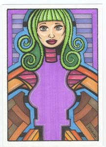
In this first drawing I’m featuring a single color, the purple, and building the rest of the color around it. The brightness of the green hair grabs you attention first but everything is still built around the purple. That’s the rock. I’m also bouncing the flatness of graphic forms against the modeled features of her big-eyed face and strange arms. I’m a fan of flatness and that is a big part of what this image is about. Many of my paintings feature the flat plane of the canvas. It’s the legacy of modernist painting and I find that it suits me. Besides the Copic markers there is some white charcoal pencil in there.

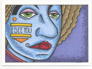
In the second drawing, that has the obvious title of “I See You”, you can see my love for drawing weird faces. Oddly enough the black line in all of these marker drawings isn’t made with a Copic marker. I find that is I use a black Copic marker it bleeds/blends into the color. That makes sense since Copic markers are made so you can blend the colors together but I never want my black line to bleed into the color. I ended up using a Japanese Sign Pen for the black line. It’s dull, water based, and stays put. Just as often I’ll use a brush and India ink but never a Copic black sketch marker. The Copic Multiliner black marker is a different type of marker and won’t bleed but is too small for my taste except on rare occasions. In this drawing I’m using a scumbling technique to dab color on and blend layers of different color together. I’ve only used that technique recently and find that I like if for my weird faces.

The third marker drawing is one of my “Eyeboob” drawings. Don’t ask me how I think these things up but the naming is rather straightforward. This one is not about flatness but about modeling. I used the color techniques that I learned way back in the mid 1990s when I was learning to painting gouache and there is more color in there than is obvious. I start with three values of a color. Let’s say a dark, medium, and light of her skin tone. After I draw those in I pick a dull shadow tone. That pushes the shadows back in space. After that I pick a warm highlight tone and use a little of that to add life to the lighter areas without pushing them back in space. Finally I go in with some white charcoal highlights. These I like to make dance around the surface of the drawing. They’re not always about reality but too many of them in the wrong places can make everything look phony. White highlights are the final touch but I have to be careful not to overdo it.

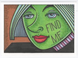
The fourth and final marker drawing here is another of my faces. I made both of these faces this week and couldn’t choose between them so I posted both. Once again I’m using that scumbling technique. Much like the figure drawing from above there is more color in there then is first apparent. There are darks and lights and dulls and cools plus some highlights. This face is about roundness but with some flatness thrown in too. The first face had barely a hint of flatness but this one has the big black shape of his shoulder standing up to be counted. Here I used flatness to bend the space. That shoulder is so long and not exactly where it would be in reality so it starts to more forward in space a little. It’s one of those weird things to be found when sketching and playing with shapes. Sometimes I like to reflect reality and sometimes I like to play with it.
One last thing. What do those two faces have in common? The color of their lips is red. I like to make faces of every color. I’ve got green and blue on this very page. One of the stranger things that I’ve learned about making weird colored faces is that the lips can’t be a weird color. I used to think that if I made a blue face the lips should be blue and a green face should have green lips. The color of the lips should be a darker color of the skin tone similar to what our lips are. I could never work that out. Whenever I would make blue or even bluish lips on a blue face it would look funny. So I started making them all red all the time. I find that works much better even when I think it shouldn’t. Take, for example, this green face. Green and red are complimentary colors which means that they have habit of fighting each other for our visual attention. You have to be careful with complementary colors because they don’t harmonize well together. But the red lips look perfectly normal even on a green face. Red lips seem to anchor an unreal face in reality. At least for me. Maybe someone else has a different approach and can make it work but not me. Lips will almost always be red.

Discussion ¬